
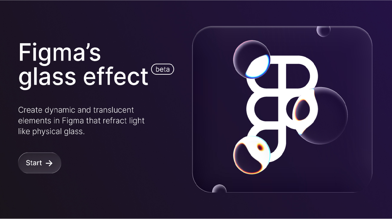
The Glass Effect is changing how teams approach UI design. It brings depth, light, and soft refraction to interfaces without heavy visuals. At Graphymania, we see the Glass Effect as a practical way to improve focus, guide attention, and elevate brand feel across web and app design. And because it is now native to Figma, you can build cleaner, faster, and more consistent interfaces from wireframe to handoff.
What the Glass Effect is (and what it is not)
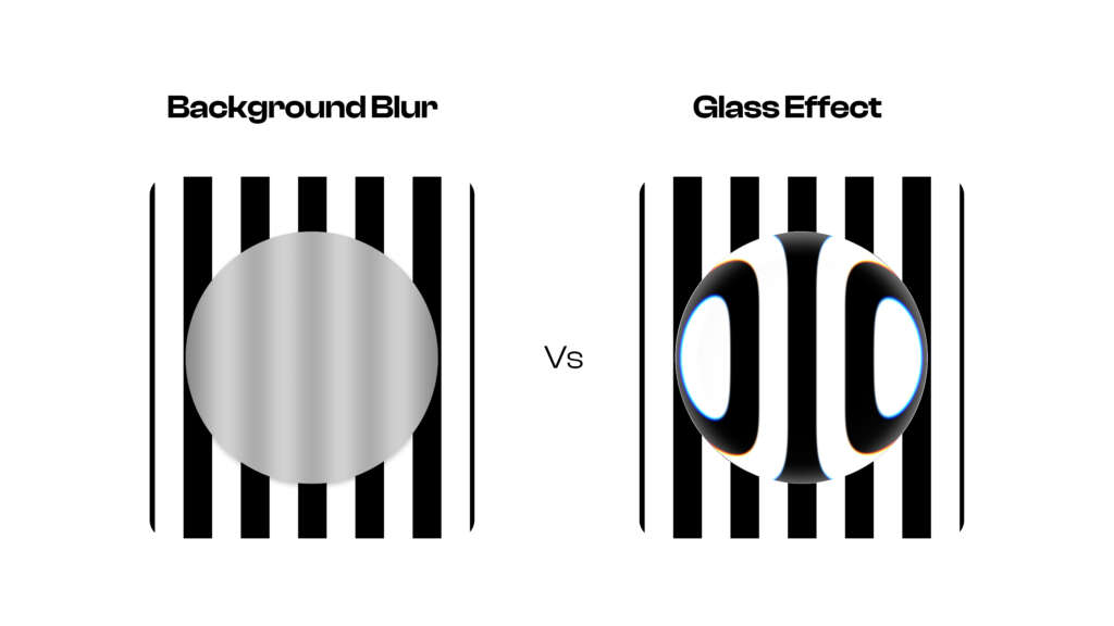
The Glass Effect in Figma gives frames a translucent look that reacts to what sits behind them. Unlike a simple glass blur or background blur, it simulates curved edges and light, which feels closer to real-world glass. As a result, cards, modals, and toolbars gain depth without needing heavy 3D assets. However, it is not a magic filter for every surface. It is best used to lift key elements while keeping the layout calm and readable.
- It applies to frames (not shapes alone), and you can apply one Glass Effect per frame.
- It is in open beta, so you may see performance slowdowns on complex layouts. Therefore, test early.
- It will not render if your frame fill is 100% opaque; keep some transparency.
- Mixed corner radii on the same frame are not supported; use the same radius on all corners.
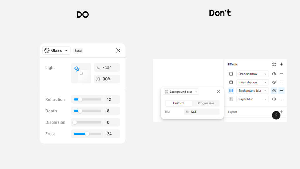
- You cannot combine the Glass Effect and background blur on the same layer. Moreover, if both are set, only the first one will render.
Why the Glass Effect matters for UI and UX
When used with care, the Glass Effect supports a clear hierarchy. It lets you place content over busy backdrops while keeping the text legible. Because it hints at depth and light, it naturally guides the eye. Consequently, navigation bars, floating panels, and alerts can stand out without looking heavy or loud. This aligns with good UI design principles: clarity, focus, and balance.
From a UX view, the effect introduces a softer, more tactile feel. It can signal interactivity, reduce cognitive load, and help users scan. Still, you should test contrast and motion across themes. As always, clarity comes first; style supports the message.
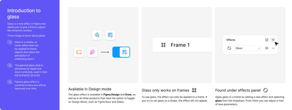
How to apply the Glass Effect in Figma (step-by-step)
Follow these steps to apply glass to a frame:
- Select a frame.
- In the Effects panel, click the plus icon.
- Choose Glass.
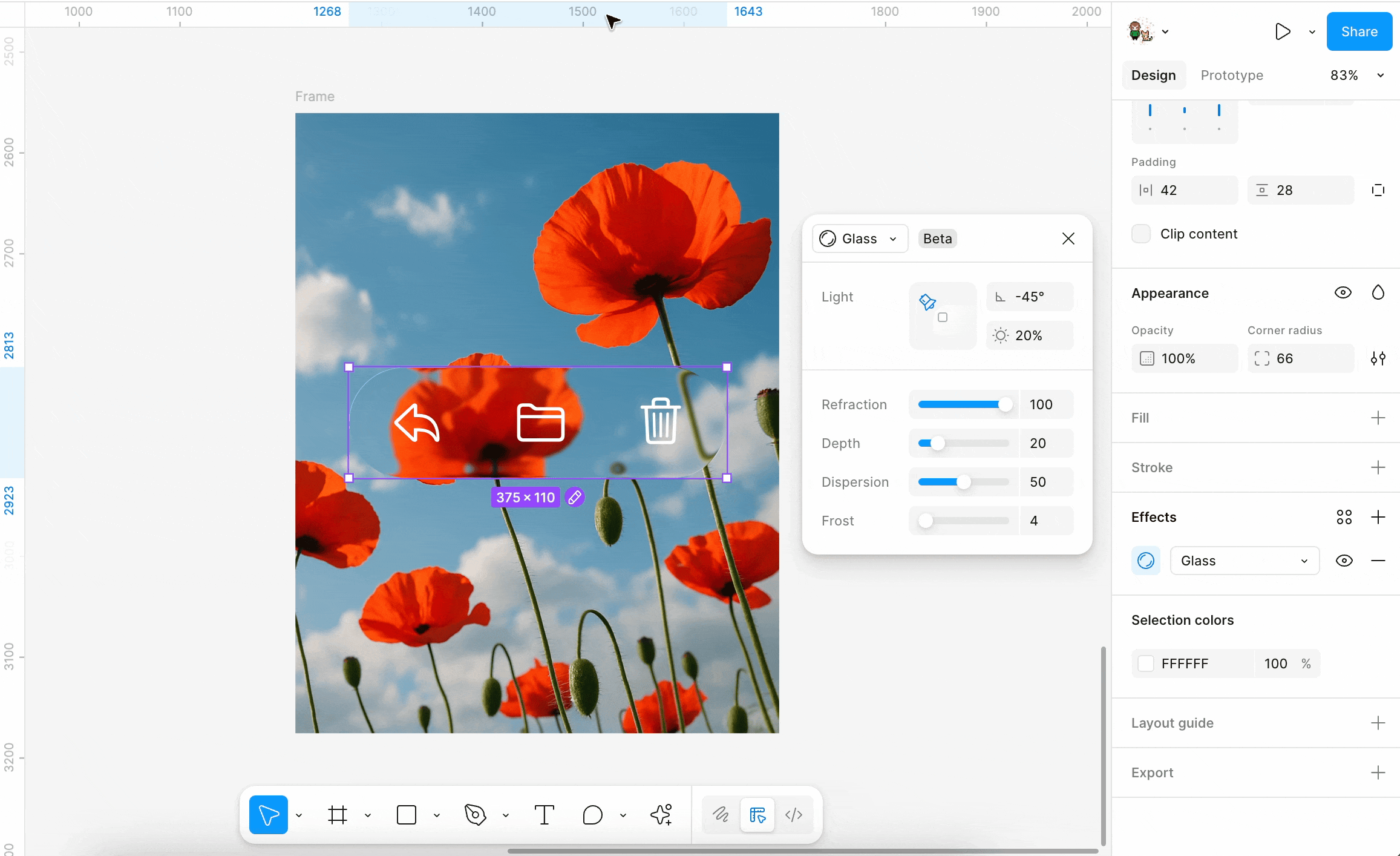
- Open Effect settings to tune Light Angle, Light Intensity, Refraction, Depth, Dispersion, and Frost.
Important notes and limits:
- Only frames can have the Glass Effect, and only one per frame.
- Frames must have the same corner radius on all corners.
- Fills at 100% opacity will hide the effect; lower opacity slightly.
- Glass does not support environmental reflections.
- Export to SVG is not supported.
- Glass is not available in Figma Sites.
- You cannot combine background blur and Glass Effect on the same layer; they render in the same visual layer and conflict. If you place a glass layer on top of a layer with blur, it can still show the glass effect. But if you put the blur layer on top of the glass layer, the glass effect won’t be seen
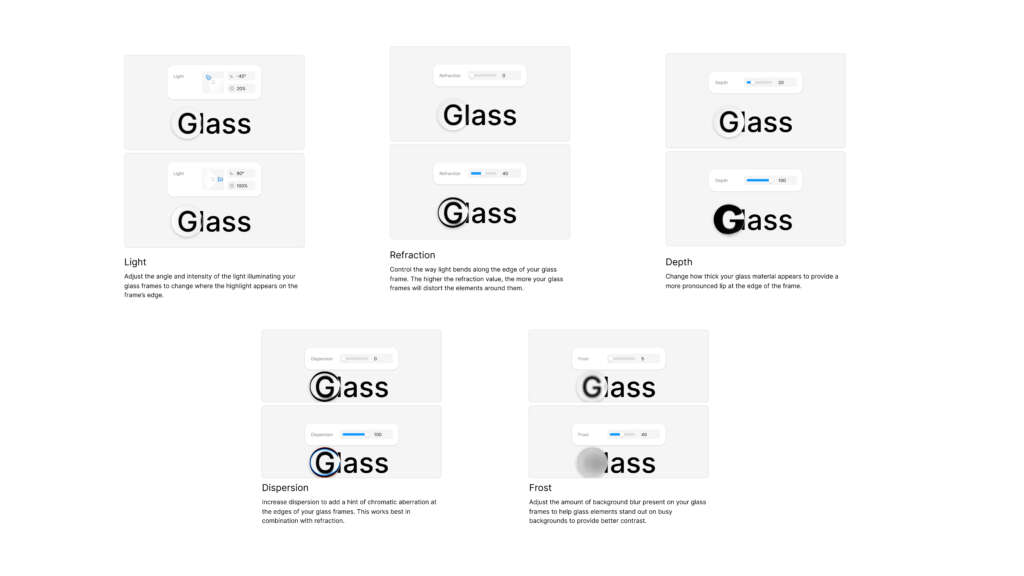
Tuning the controls: Practical ranges and tips
Each control shapes the look and clarity of your glass surface. Here is how to think about them:
- Light Angle: Sets the direction of light. For consistency, align this with your global elevation logic. For example, use a 30–60° angle from top-left for dashboards to mimic a soft daylight source.
- Light Intensity: Controls the brightness of highlights. Start modest and increase only when needed to separate elements from a colorful UI.
- Refraction: Bends the background along the curved edge. A small amount adds realism; too much can distort key content under the glass.
- Depth: Defines how far the curved edge extends inward. Low to medium depth preserves a premium feel without turning into a bubble.
- Dispersion: Adds a subtle rainbow along the edge. Use sparingly for brand accents. Turn it off on dense data screens.
- Frost: Adds background blur within the glass. Increase until the content is readable, then stop. Remember, too much frost can hide the context you want to keep.
Quick starting points:
- Cards and panels: low depth, low refraction, low frost, low intensity.
- Modals and drawers: medium frost for focus; low dispersion for calm.
- Toolbars: very low frost and depth; rely on spacing and contrast.
- Notifications: medium intensity to separate from background art.
Design systems: Making glass work across components
Glass belongs in your design system, not just in one-off screens. Therefore, document tokens and patterns so teams apply it the same way everywhere.
System checklist:
- Tokens: define light angle, default intensity, frost ranges, and corner radii.
- Surfaces: set tiers (e.g., base, raised, glass-elevated).
- States: show how glass surfaces look in hover, focus, pressed, and disabled states.
- Color: specify backgrounds behind glass (gradients, noise, or soft shapes) to avoid chaos.
- Scale: outline sizes for cards, modals, and toolbars with shared spacing.
- Responsiveness: adjust frost and text contrast across breakpoints.
Figma tips:
- Create styles for effect presets (e.g., “Glass/Card/Low-Frost”).
- Use Figma Components to enforce visual rules and speed revisions.
- Maintain a single source of truth for Glass Effect across libraries.
- Ensure tokens sync across light and dark modes so glass remains readable.
Performance, legibility, and accessibility
While the Glass Effect looks refined, it impacts performance on complex pages.
Consequently, try these guardrails:
- Keep glass surfaces simple; avoid deep nesting.
- Limit the number of overlapping glass frames.
- Reduce frost on busy scenes to cut render strain.
- Test on mid-range devices and real browsers via prototypes.
For accessibility:
- Always check the color contrast of text on glass.
- Prefer solid chips or backplates behind small text on glass.
- Avoid high dispersion and refraction behind the body copy.
- Provide motion-safe themes; reduce light intensity for users who prefer less motion or glare.
A readable interface beats a pretty one. Therefore, tune the effect after you finalize content and layout, not before.
Real-world use cases and layout patterns
Use glass where it adds value:
- Navigation bars and toolbars: Provide separation over live content without using heavy shadows.
- Floating action panels: Offer on-canvas controls over maps, media, or charts.
- Modals and drawers: Keep context visible while focusing the user on the task.
- Cards and widgets: Add depth to dashboards without bright borders.
- Notifications and toasts: Lift important messages from backgrounds.
- Login user interface design: Calm, premium visuals over brand imagery.
Pattern ideas:
- Gradient behind glass: a soft colorful UI gradient at low opacity under glass for warmth.
- Texture or noise under glass: adds tactile feel without clutter.
- Layer priorities: content > glass surface > background art.
Workflow tips for teams in Figma
To keep work fast and clean:
- Start with plain frames and content first, then apply glass.
- Use Figma Components to reuse glass-ready panels.
- Name effect styles clearly: “Glass/Toolbar/Light,” “Glass/Modal/Focus.”
- Keep a “playground” page for testing frost and depth on your real content.
- Document do’s and don’ts in your system file for new teammates.
- For search variants users might type, include “figma design,” “figma app,” “fig ma,” and “fi g ma” in your content metadata and alt text where sensible.
If you are just getting started, download Figma and explore starter templates to see how glass sits within common layouts. Then, save presets for repeat use.
Common pitfalls and how to avoid them
- Mixing background blur and glass on the same layer: They conflict. Therefore, use only one on a layer; if you need both, layer separate frames in the right order.
- Mixed corner radii: The effect will not render as expected. Keep a single radius value per frame.
- 100% opaque fills: The Glass Effect becomes invisible. Reduce opacity to reveal it.
- Hard-to-read text: Increase frost, add a subtle backplate, or reduce the background’s contrast.
- Overusing dispersion: Reserve rainbow edges for brand moments, not dense data screens.
- Overlapping glass frames: Keep overlaps minimal to avoid both clutter and performance cost.
Beyond glass: Pairing with other effects (safely)
You can still use other effects in your design; just apply them to different layers or components to avoid conflicts.
- Drop shadow: Add soft shadows to the content inside the glass for focus.
- Inner shadow: Suggest inset depth for pressed states.
- Layer blur: Blur background art slabs behind the glass, not on the glass layer itself.
- Noise and texture: Apply to background layers to create subtle material contrast.
- Blend modes and fills: Combine with gradients under glass for richer scenes.
Remember, background blur and glass render in the same visual layer. Thus, stack them as separate frames in the correct order if you need both in the same area.
Graphymania builds crisp, modern interfaces that scale. We fold the Glass Effect into your design system so it works for dashboards, mobile apps, and websites, not just in a single mockup. Moreover, we prepare reusable Figma Components, presets, and tokens that your team can drop into live projects. Finally, we hand off to engineering with specs that respect performance, accessibility, and brand.
What you get:
- Glass-ready components, variants, and tokens
- Contrast-tested patterns for light and dark modes
- A documented style file with presets for common use cases
- Real device tests and dev notes that reduce rework
Want to see a live demo in your space?
Let’s set up a working session and build your first glass surface together.
Conclusion
The Glass Effect gives your product a modern lift without heavy visuals. It brings clarity, depth, and a premium feel to core surfaces when used with intent. When you use the Glass Effect across your whole design plan, your team can work quickly, your screens look more organized, and your brand stands out better. At Graphymania, we turn this into a practical toolkit you can ship today.
Ready to integrate the Glass Effect into your next release?
"Design is not just what it looks like, it's how it works, feels, and inspires meaningful action."

MOHD ARMAN
FAQs
1. What is the Glass Effect in Figma?
It is a special tool for frames that makes them look like clear glass. You can change how the light looks, how the edges bend, how deep they go in, how much rainbow color you see, and how blurry the background looks behind the glass. It helps separate content from backgrounds while keeping context visible.
2. How is it different from background blur?
Background blur simply blurs content under a layer. The Glass Effect adds curved edge behavior, light, and optical character. Therefore, it feels more like real glass and provides better depth cues.
3. Can I use Glass and background blur together?
Not on the same layer. If both are present, only the first effect renders. However, you can stack separate frames to combine them in a scene.
4. Why can’t I see the Glass Effect on my frame?
Common reasons include: the frame fill is 100% opaque, mixed corner radii, or background blur sits above the glass frame. Reduce fill opacity, unify radii, and adjust the layer order.
5. Does the Glass Effect work on shapes?
No. It applies to frames. Convert shapes into frames or wrap content inside a frame before applying the effect.
Still here?
Great. Share your goals, and Graphymania will help you design, test, and ship elegant interfaces with the Glass Effect — fast and on brand.