More designers are entering the industry every year, and competition for a UI/UX Designer Job is rising fast. But most applicants lose opportunities not because they lack talent, but because they repeat simple mistakes that hiring managers notice immediately. And when these errors pile up, they quietly block interviews, offers, and long-term career growth. So in this blog, we’ll break down the ten most common design and portfolio mistakes stopping you from getting hired in 2026.
1. Cluttered Interface
A cluttered interface instantly signals a lack of clarity, and recruiters judge this as poor usability understanding. When layouts feel cramped, users struggle, and hiring managers assume the same confusion will appear in your real projects.
Why This Mistake Matters
Clutter reduces readability, increases cognitive load, and creates friction. As a result, the design looks unfinished, and your understanding of ui design fundamentals appears weak.
How to Fix This Mistake
Use whitespace to guide attention
Follow a clear hierarchy for headings and content
Reduce unnecessary elements
Keep only what supports the user’s goal
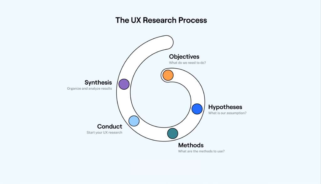
2. Designing for Yourself and Skipping User Research
Many beginners design screens based on personal taste. However, real products succeed only when they solve real user problems.
Why This Mistake Matters
When you skip research, you miss context, motivations, and pain points. Therefore, your designs look visually good but fail functionally. Recruiters want problem-solvers, not decorators.
How to Fix This Mistake
- Conduct quick interviews
- Create user personas
- Map user journeys
- Validate assumptions with real feedback
3. Blindly Copying the Work of Competitors
Competitor research is helpful, but copying layouts, styles, or flows makes your work look generic.
Why This Mistake Matters
Hiring managers quickly recognise copied patterns, and this hurts trust. In addition, it shows you cannot think independently or justify your decisions.
How to Fix This Mistake
Study competitors for insights, not inspiration
Identify gaps and opportunities
Bring your unique approach to solving the same problem
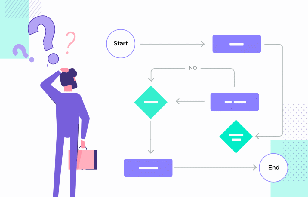
4. Confusing Navigation
Navigation is the backbone of any product. So when it is confusing, the entire experience suffers.
Why This Mistake Matters
If users cannot find what they need, they leave. And hiring teams assume your design process lacks flow thinking.
How to Fix This Mistake
Use clear labels
Maintain predictable patterns
Avoid deep menu layers
Test navigation with users
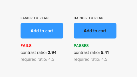
Colour and typography directly impact accessibility.
Why This Mistake Matters
Low contrast makes content hard to read. Bad font pairing makes the UI feel unprofessional. As a result, your work appears unpolished.
How to Fix This Mistake
Follow WCAG contrast ratios
Pair fonts with balance (display + readable body)
Test text on different screen sizes
Also Read: Understanding the Most Popular Colors and Their Impact on Your Brand’s Decisions
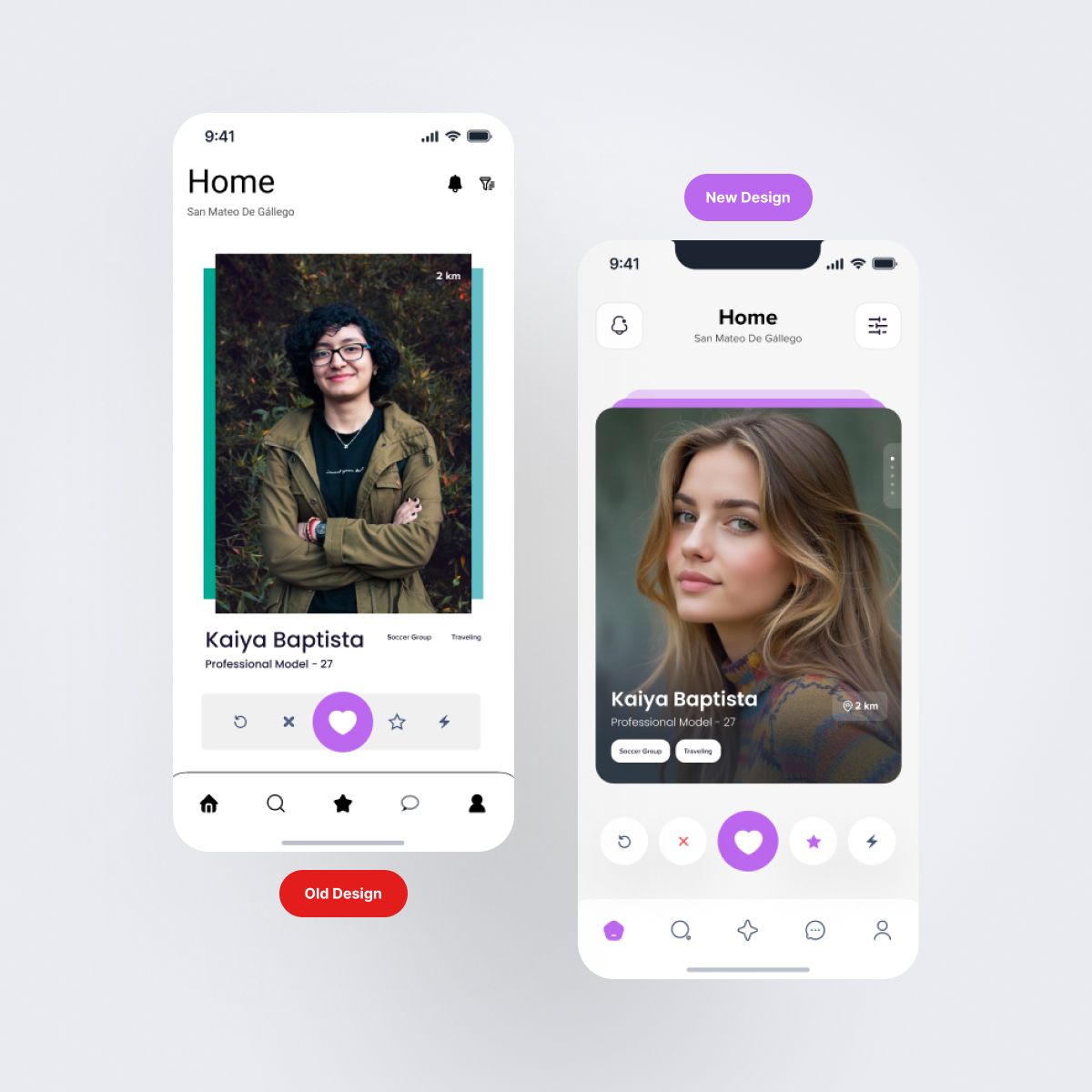
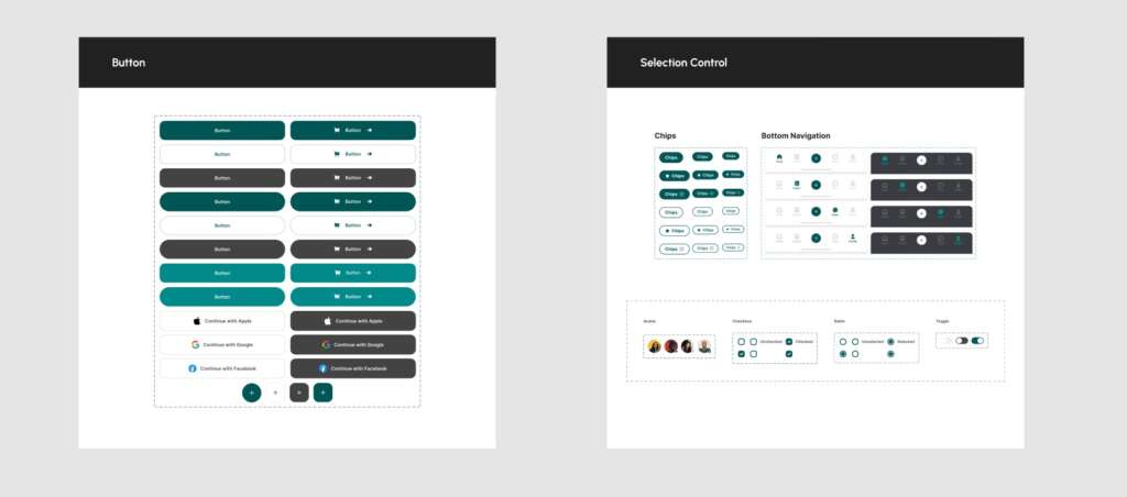
6. Inconsistent Design
Inconsistency breaks trust and makes your interface feel unstable.
Why This Mistake Matters
Buttons, spacing, and patterns that change from screen to screen signal a lack of design systems knowledge.
How to Fix This Mistake
Create a mini design system
Use consistent spacing rules
Define components early
Stick to reusable patterns
7. Unclear Call-to-Actions (CTAs)
If your users don’t know what to click, they won’t act.
Why This Mistake Matters
Weak CTAs kill conversions. And hiring managers assume you do not understand product goals.
How to Fix This Mistake
Use strong action verbs
Highlight the primary CTA
Reduce visual noise around the button
Ensure every screen has one clear action

8. Too Many Design Elements on the Screen
More details don’t always mean better design.
Why This Mistake Matters
Over-designed screens confuse users and distract them from the core task.
How to Fix This Mistake
Start with wireframes
Prioritize key actions
Remove decorative elements that don’t serve a purpose
9. Ignoring User Feedback
Feedback is not optional — it’s a core part of product improvement.
Why This Mistake Matters
When you avoid testing or ignore feedback, your designs feel disconnected from real usage.
How to Fix This Mistake
Ask for feedback early
Use surveys, interviews, usability tests
Track repeated issues and refine
10. Not Testing Before Presenting Your Work
Many designers rush to show visual screens but skip validating interactions.
Why This Mistake Matters
If the prototype breaks, the flow feels off, or animations look rough, recruiters lose confidence.
How to Fix This Mistake
Test flows using prototypes
Check button states, transitions, and labels
Fix micro-interactions before sharing
Conclusion
Getting a UI/UX Designer Job in 2026 requires more than good visuals — it demands clarity, consistency, and strong problem-solving. And when you avoid these common mistakes, your portfolio becomes stronger, your design voice becomes clearer, and your chances of landing the right opportunity increase significantly.
"Clarity beats creativity when you're aiming to get hired — it’s a story of how you solve real problems"

MOHD ARMAN
FAQs
1. How do I start preparing for a UI/UX Designer Job in 2026?
Focus on building a strong portfolio, improving your ui ux fundamentals, and showing projects that solve real problems.
2. Does user research matter for entry-level ux design roles?
Yes. Even simple research shows your ability to understand users and make better decisions.
3. How many projects do I need to apply for a ui designer job?
Three well-explained case studies with clear processes are better than ten rushed ones.
4. Can a freelance graphic designer switch to UI/UX easily?
Yes, because graphic design skills help in visual structure, and UX skills can be learned with practice and testing.
5. Do design systems help with user interface jobs?
Absolutely. A basic component library shows employers that you understand consistency and scalability.