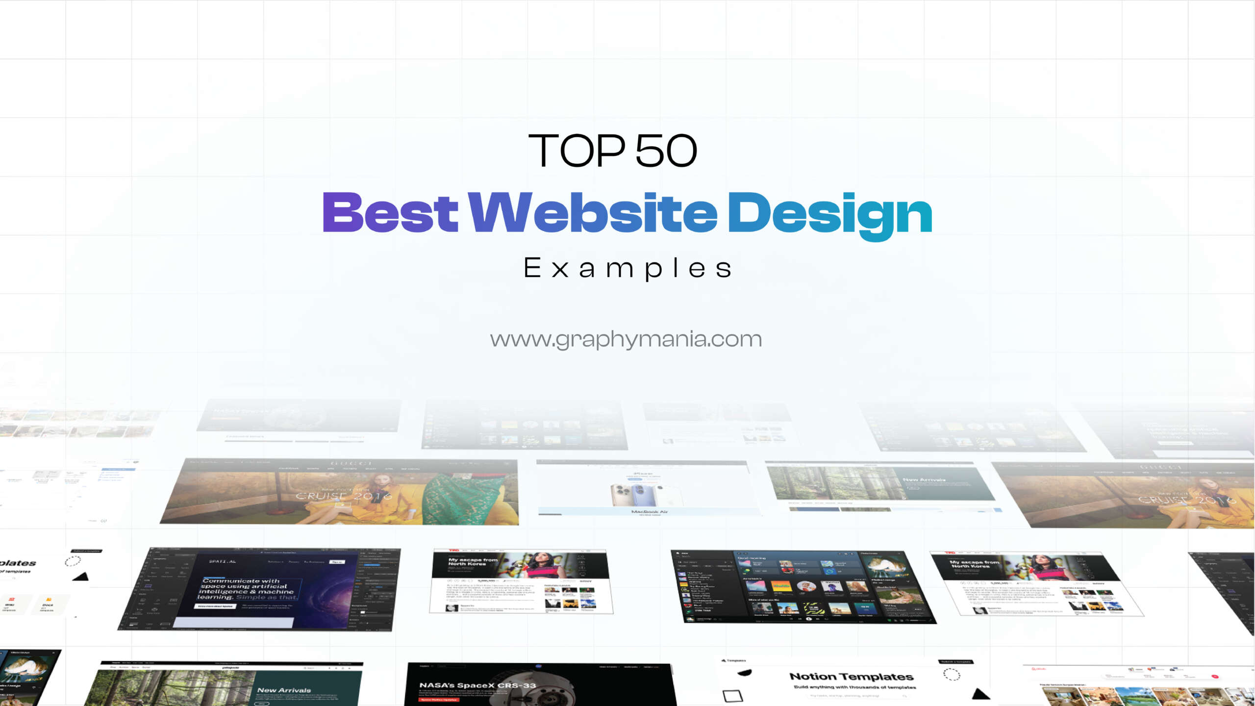
If you’re searching for the best website design inspiration, you’re in the right place. In 2025, a well-designed website isn’t just about looking good—it’s about usability, storytelling, and user experience. According to research, 75% of users judge a brand’s credibility based on its website design. That means your homepage, landing page, or portfolio can either attract or repel users in just a few seconds.
That’s why at Graphymania, we’ve curated this list of the 50 best website design examples from across industries. From sleek web designs in fashion to functional website design for tech consultants, this guide highlights the work of designers pushing the boundaries of creativity.
Let’s dive in.
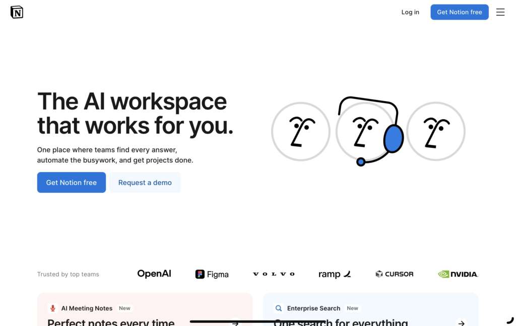
Why this design stands out:
- Minimalist interface: The clean and simple design helps users focus on the content.
- Seamless user experience: Notion’s intuitive design allows users to easily switch between workspaces without feeling lost.
- Strategic use of typography: Fonts are clean, modern, and highly readable, improving overall user experience.
- Bold, but not overwhelming: Despite the minimalist design, key actions are highlighted through subtle color contrasts.
- Responsive design: It adapts seamlessly across all devices, maintaining the fluid experience.
Takeaway for designers:
Notion demonstrates how a minimalist approach can lead to a more immersive and enjoyable user experience. It shows the importance of balancing whitespace and key actions, ensuring that the design complements the content without overwhelming it.
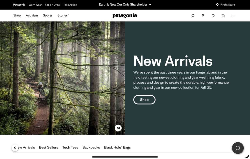
Why this design stands out:
- Beautiful imagery: Stunning high-quality images that reflect the brand’s values of nature and adventure.
- Eco-friendly branding: The design embraces natural, earthy tones that align with its environmental message.
- User-centered design: Navigation is clear, and the site encourages customers to explore more products through intuitive calls-to-action.
- Sustainability narrative: Storytelling is used effectively to communicate the brand’s commitment to sustainability.
- Minimal distractions: The design keeps focus on products while offering clear pathways to purchase.
Takeaway for designers:
Patagonia’s website design is a great example of how to design around a brand’s core mission. The design supports the narrative while being functional and simple, allowing the brand’s story to shine through naturally.
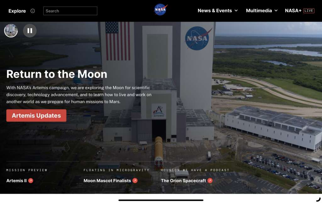
Why this design stands out:
- Visually engaging: NASA’s website makes excellent use of interactive elements like videos, 3D models, and visualizations.
- Space exploration theme: The design mirrors its subject, using dark tones and galactic imagery, making the user feel like they are exploring the universe.
- Dynamic content: Regular updates and relevant information ensure that the site remains fresh and informative.
- Interactive design: NASA uses cutting-edge design elements to encourage interaction, like clickable infographics and live space feeds.
- Educational yet simple: Despite the complexity of the subject matter, the design is easy to understand.
Takeaway for designers:
NASA’s website demonstrates the importance of combining highly engaging visuals with educational content. It’s an excellent example of how to balance interactive elements without compromising on usability.
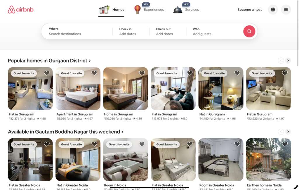
Why this design stands out:
- Personalized experience: The homepage adapts based on the user’s location, displaying relevant destinations and stays.
- User-first navigation: The search function is front and center, allowing users to quickly find accommodations with intuitive filters.
- Storytelling with visuals: Airbnb uses beautiful imagery to capture the essence of the locations, making it not just a booking site but a travel inspiration hub.
- Trust-building design: Reviews, ratings, and host information are integrated seamlessly to enhance credibility.
- Mobile optimization: The mobile version provides the same fluid experience, showcasing strong responsive design.
Takeaway for designers:
Airbnb’s design shows the power of personalization and how a user-centered design can drive conversions. By focusing on the needs and preferences of the user, it creates an engaging and seamless experience.
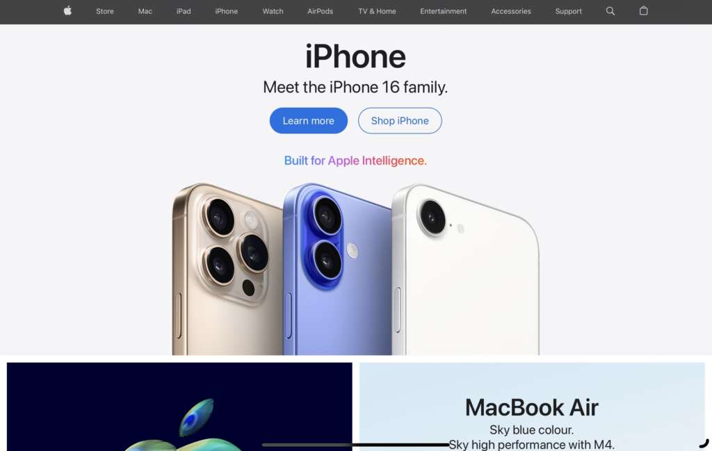
Why this design stands out:
- Sleek, minimalist aesthetic: Apple’s design philosophy emphasizes simplicity, letting products take center stage.
- High-quality imagery: Every product is showcased through stunning photography, highlighting details and functionality.
- Effective call-to-actions: The site’s buttons and CTAs are bold, ensuring that users know exactly what to do next.
- Intuitive navigation: The navigation bar is clean and easily accessible, guiding users to the product categories that interest them.
- Emphasis on brand identity: Apple’s design consistently reflects its brand’s premium, modern, and minimalist values.
Takeaway for designers:
Apple’s website shows that sometimes less is more. By focusing on sleek design, high-quality visuals, and user-friendliness, Apple creates an experience that complements its premium products.
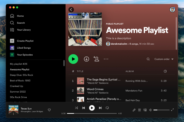
Why this design stands out:
- Personalized homepage: Spotify uses smart algorithms to display recommended music based on listening history.
- Bold, vibrant colors: The use of color enhances the visual appeal and guides users’ attention to key elements.
- Emphasis on content: Music, albums, and playlists are displayed with large cover images that make the content pop.
- Dynamic and interactive: The design incorporates dynamic elements such as autoplay previews and easy sharing options.
- Mobile optimization: The mobile version provides an equally engaging experience as the desktop version, ensuring usability on any device.
Takeaway for designers:
Spotify’s design excels at personalizing the user experience. For designers, it’s a great lesson on using data to curate content and ensuring that the design elevates the user’s experience at every step.
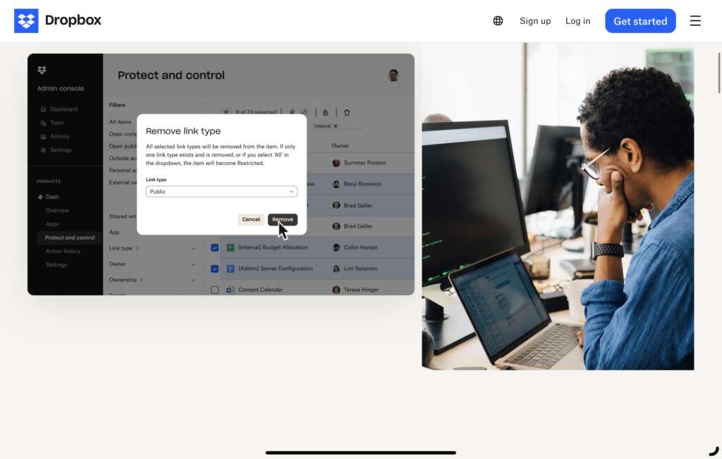
Why this design stands out:
- Clean, uncluttered design: Dropbox’s minimalistic approach ensures that visitors aren’t overwhelmed, with focus placed on key features.
- Easy navigation: The simple layout allows users to quickly access their files and understand what to do next, reducing cognitive load.
- Subtle branding: Dropbox uses its blue and white color palette to reinforce its brand identity without overwhelming the visitor.
- Interactive elements: Hover effects on buttons and icons enhance the user experience by providing instant feedback to actions.
- Effective use of space: Dropbox utilizes whitespace efficiently, making the content feel less cramped and more accessible.
Takeaway for designers:
Dropbox is a perfect example of how simplicity can lead to powerful functionality. For designers, it’s a lesson in creating intuitive layouts that guide users effortlessly while maintaining visual clarity.
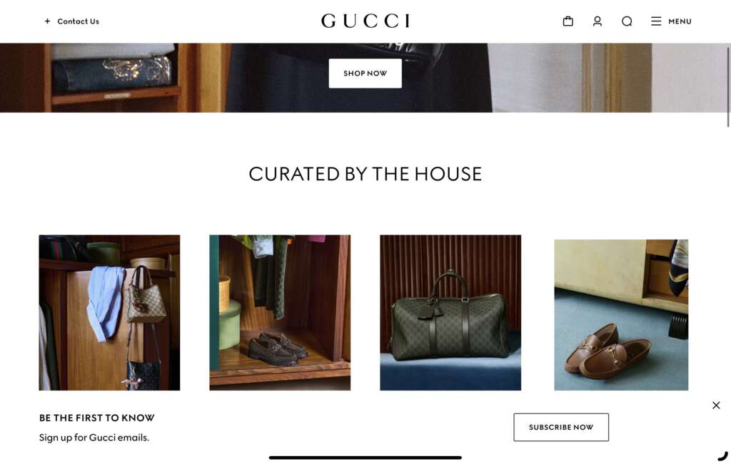
Why this design stands out:
- High-fashion aesthetics: Gucci’s website reflects the brand’s luxury identity with bold, sophisticated design choices that highlight products in a chic manner.
- Story-driven design: The use of imagery and interactive elements tells a compelling story about the brand, immersing visitors into the Gucci lifestyle.
- Fluid animation: The subtle animations on the website make for an engaging browsing experience while maintaining a high-end, smooth feel.
- High-quality visuals: Every product image is crisp and detailed, emphasizing the quality of Gucci’s offerings.
- Modern interface: Despite its luxury focus, the site embraces a modern, user-friendly design that encourages easy navigation.
Takeaway for designers:
Gucci’s site is a masterclass in combining luxury with modernity. It teaches how to balance high-end visuals and interactive elements without losing the overall brand essence.
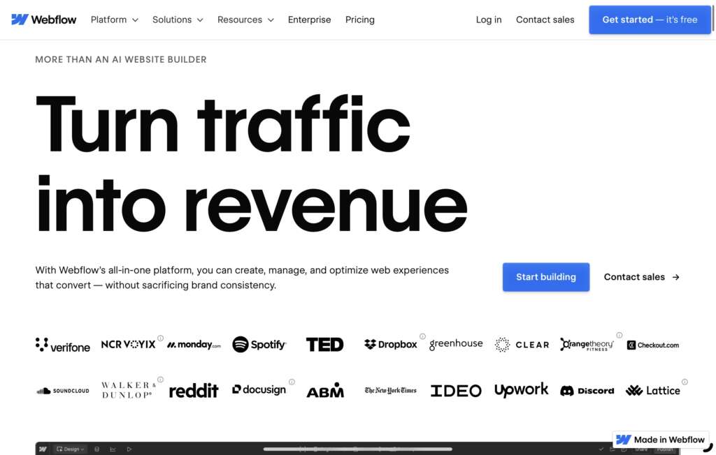
Why this design stands out:
- Elegant typography: Webflow uses bold and modern typography to grab attention and improve readability.
- Interactive visuals: The use of dynamic content such as parallax scrolling and hover animations makes the design come to life.
- Intuitive interface: Webflow’s design is aimed at professionals who appreciate a clean layout with clear calls to action.
- User-focused experience: The interface is designed with ease of use in mind, ensuring users can quickly find the tools they need.
- Responsive design: The site adapts beautifully to any device, ensuring a consistent user experience from desktop to mobile.
Takeaway for designers:
Webflow excels in demonstrating how interactive and responsive design can provide a professional yet engaging user experience. Designers can learn how to incorporate cutting-edge design elements while keeping user needs at the forefront.
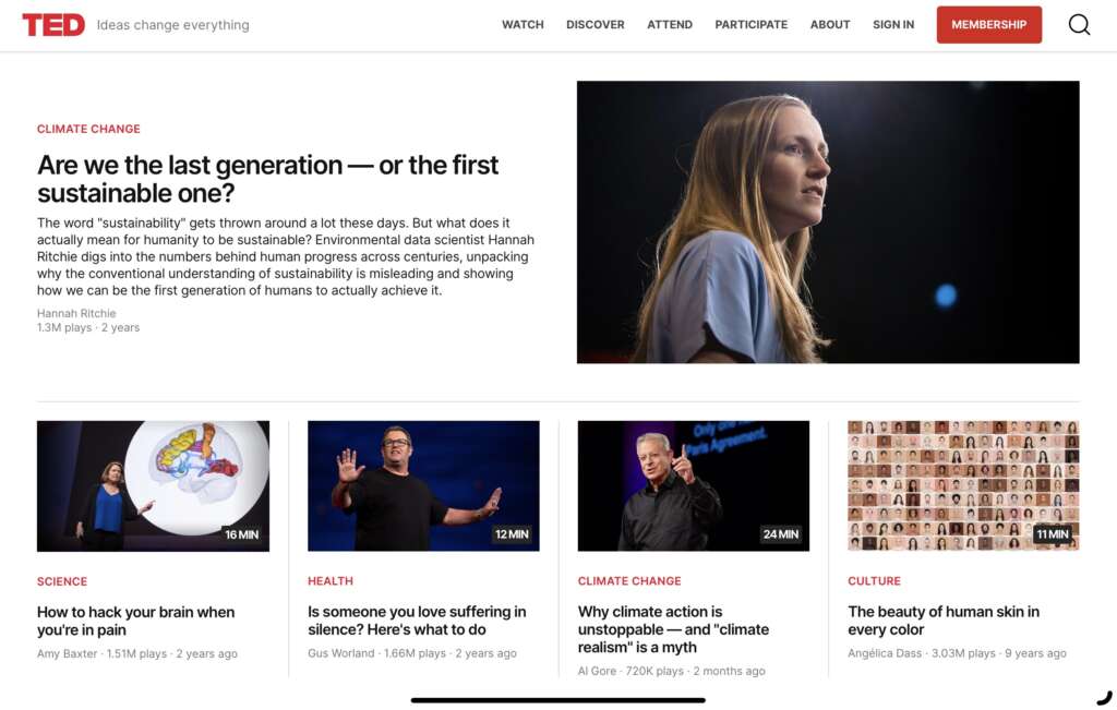
Why this design stands out:
- Impactful visuals: TED uses captivating imagery and videos to draw visitors in, allowing the content to take center stage.
- Clear content hierarchy: The design makes it easy for users to access content by clearly distinguishing between different categories, talks, and topics.
- Responsive design: TED’s design ensures that users on any device will have a seamless experience, with quick loading times and easy navigation.
- Engaging typography: Bold and clear typography adds personality to the content, drawing attention to key ideas.
- Effective search function: The search bar is easy to locate and simple to use, helping users quickly find talks that interest them.
Takeaway for designers:
TED’s website is a great example of how engaging visuals and effective content hierarchy can turn a content-heavy site into an enjoyable experience. It also shows how dynamic content can keep users coming back for more.
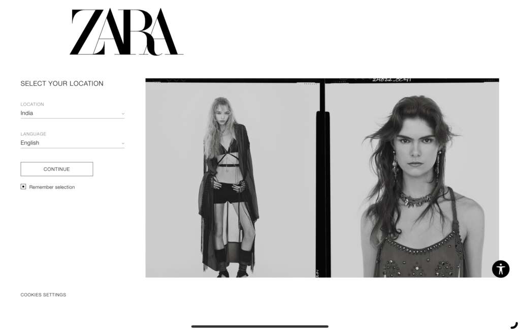
Why this design stands out:
- Fashion-forward aesthetics: ZARA’s website mirrors the brand’s trendy and sophisticated vibe with its clean, bold design choices.
- Minimal distractions: The use of ample whitespace and large visuals ensures that the focus remains on the products.
- Intuitive navigation: ZARA’s design allows customers to browse seamlessly across categories without feeling overwhelmed by choices.
- Strong call-to-actions: The primary CTA buttons are strategically placed and easy to spot, guiding users to purchase products.
- Responsive and fast-loading: The site adapts well to mobile and desktop platforms, ensuring a consistent experience across all devices.
Takeaway for designers:
ZARA teaches designers how to use minimalist design elements to showcase fashion products without unnecessary distractions. The focus on visual hierarchy and user-centered design creates an enjoyable and effective shopping experience.
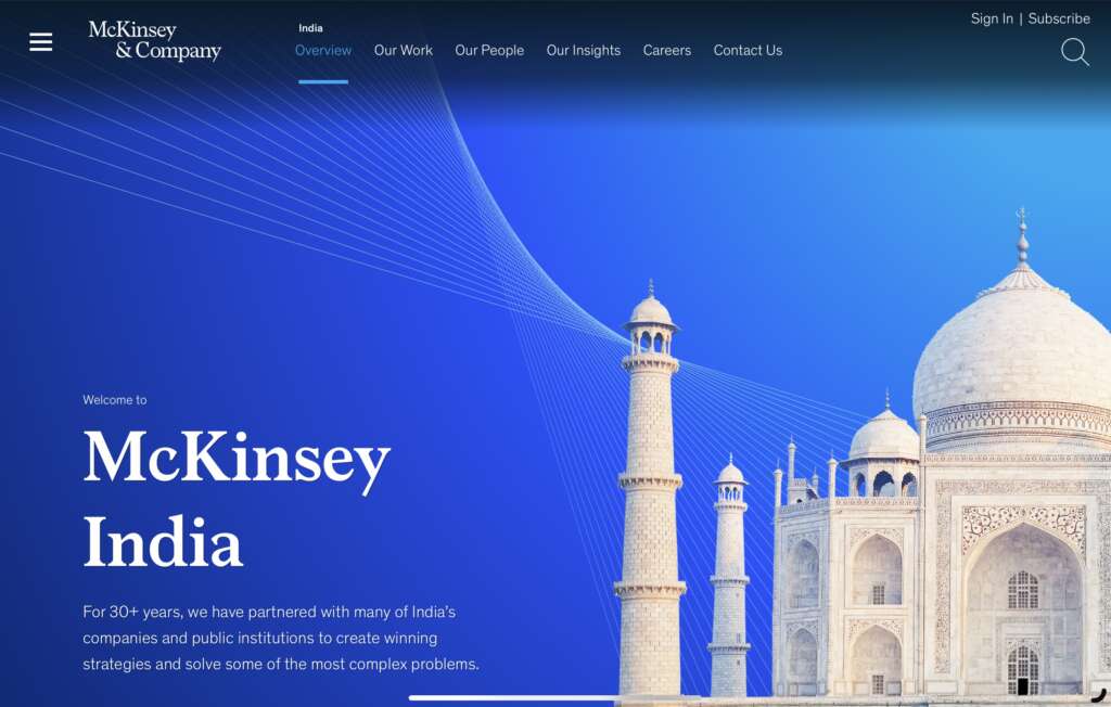
Why this design stands out:
- Professional and sleek: The design communicates McKinsey’s authority with a clean, corporate look that emphasizes expertise and trust.
- Structured content: The website uses well-organized sections to clearly present complex data and thought leadership pieces.
- Simple yet impactful typography: The website’s fonts are clear and easy to read, adding to the overall professionalism of the design.
- Bold use of color: McKinsey utilizes a refined color palette, mostly composed of muted tones that speak to its corporate identity.
- Interactive content: Interactive charts and case studies engage visitors, encouraging them to explore deeper.
Takeaway for designers:
McKinsey’s design demonstrates that simplicity, paired with strong visual hierarchy, is key for corporate sites. It shows how to structure content for maximum clarity and impact while maintaining a professional aesthetic.
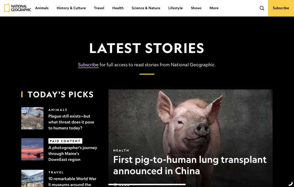
Why this design stands out:
- Vivid photography: National Geographic’s use of stunning imagery immerses visitors in the world of nature and science.
- Storytelling design: The website combines visual storytelling with compelling articles, creating a dynamic and informative experience.
- Clear navigation: The design provides clear access to articles, documentaries, and videos, allowing users to explore content effortlessly.
- Cohesive design: The use of a consistent color palette and typography aligns with the brand’s natural, explorative image.
- Interactive elements: Dynamic infographics and interactive maps engage users, allowing them to explore content on a deeper level.
Takeaway for designers:
National Geographic shows how to combine visual storytelling with interactive design elements, making the website both educational and visually stunning. It’s a great example of how to capture the essence of a brand through thoughtful design choices.
Why this design stands out:
- Collaboration-focused layout: Figma’s website highlights its primary value proposition—collaboration—through its design, making the user feel part of the process.
- Crisp, modern visuals: The interface is clean, modern, and designed to make users feel comfortable while navigating design-related content.
- Interactive demos: Figma provides easy-to-use demonstrations of its tools right on the website, inviting users to get hands-on.
- Seamless navigation: The structure of the website is intuitive, making it easy for both experienced designers and beginners to navigate.
- Responsive and fast: The design is optimized for both mobile and desktop experiences, ensuring accessibility for all users.
Takeaway for designers:
Figma’s website demonstrates the importance of making your product the star. The clean interface and interactive elements make the design process more tangible for users, offering valuable lessons for designers building tool-based websites.
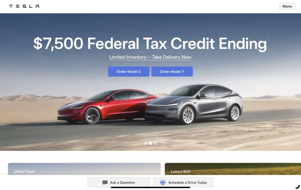
Why this design stands out:
- Futuristic aesthetic: Tesla’s website reflects its innovative spirit, using clean lines, sleek typography, and minimalist imagery.
- Dynamic product showcasing: The website allows visitors to explore each car model interactively, enhancing the product experience.
- Effective storytelling: Tesla incorporates compelling narratives to highlight its commitment to sustainability and innovation.
- Seamless mobile experience: The mobile version of the site is as fluid and responsive as the desktop version, ensuring users can explore products easily on any device.
- Clear call-to-actions: Tesla’s CTAs, like “Order Now” and “Learn More,” are prominent and easy to follow.
Takeaway for designers:
Tesla’s website design emphasizes how high-end, sleek aesthetics combined with interactive product displays can create a powerful user experience. Designers can take away the importance of creating dynamic, engaging content that matches the brand’s innovative spirit.
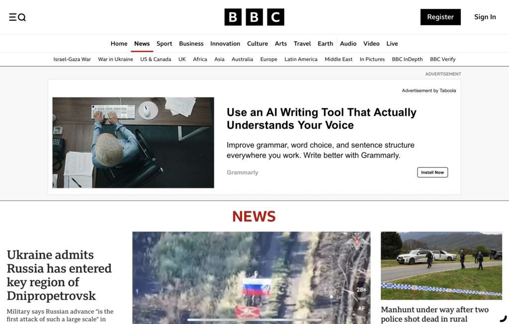
Why this design stands out:
- Engaging, clear layout: BBC’s website presents news in a straightforward, well-structured layout that allows users to find information quickly.
- Dynamic content: The homepage rotates content, providing visitors with up-to-date headlines and breaking news.
- Visually balanced: A mixture of large imagery, typography, and multimedia elements ensures the page doesn’t feel cluttered, making for an easy reading experience.
- Responsive across platforms: The design adapts seamlessly to various devices, maintaining the same quality experience across mobile, tablet, and desktop versions.
- Consistent branding: The use of red, white, and black reinforces the BBC brand, maintaining its professional and trustworthy image.
Takeaway for designers:
BBC’s website demonstrates how to design for content-heavy platforms. The balanced layout, easy navigation, and dynamic content elements highlight the importance of clarity and simplicity when dealing with large amounts of information.
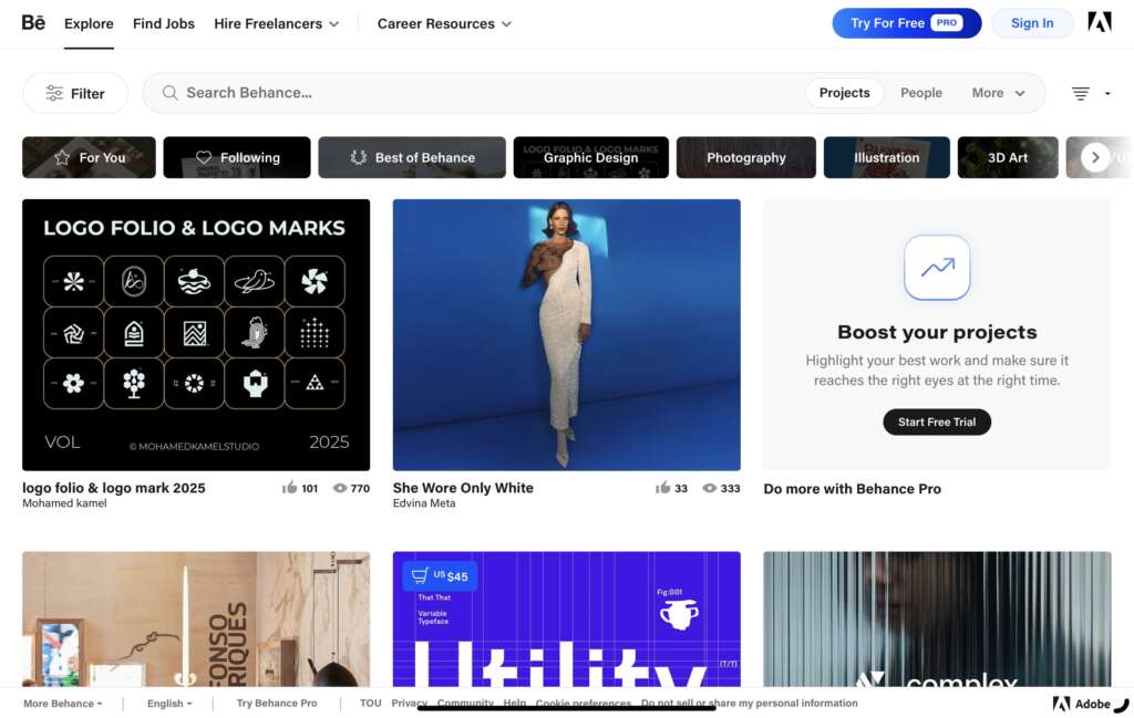
Why this design stands out:
- Showcases creativity: Behance’s design showcases visual work in a grid-based layout, making it easy to explore diverse creative projects.
- Personalized portfolio: Users can create and customize their portfolios, showcasing their work in a visually appealing and professional way.
- Cohesive color palette: The design uses a clean, minimalist color palette that lets the artwork shine without distraction.
- Seamless integration: Behance integrates with Adobe products, allowing users to directly upload and share their creative projects.
- Clear calls to action: Whether it’s “Join Behance” or “Explore Projects,” the CTAs guide users effortlessly through the site.
Takeaway for designers:
Behance serves as an excellent example of how to build an engaging platform for creatives. Designers should note how clean, grid-based layouts with the right amount of white space can allow content to shine while maintaining a smooth, intuitive user experience.

Why this design stands out:
- Ecommerce-first focus: Shopify’s design prioritizes products, making it easy for users to explore, learn about, and purchase products.
- Simple, clear layout: The homepage is simple but effective, showcasing key products and features while keeping the user experience straightforward.
- Engaging visuals: Large, high-quality images of products make it easy for users to get a close-up view of what they’re interested in.
- Interactive elements: The website features interactive product filters and easy-to-navigate menus to help users find what they need quickly.
- Mobile optimization: The mobile version of Shopify’s site maintains a seamless shopping experience with clean layouts and easy-to-tap buttons.
Takeaway for designers:
Shopify’s website is an excellent example of e-commerce design, where the focus is on simplicity, speed, and intuitive navigation. For designers, it highlights the importance of product-centric designs that make online shopping an easy and engaging process.
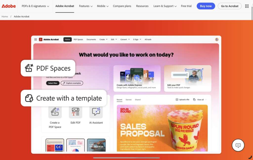
Why this design stands out:
- Creative visuals: Adobe’s site embraces its creative roots with bold, eye-catching graphics and large typography that reflect its tools’ potential.
- Clear user journey: The website guides users through the process of purchasing software or accessing educational resources, making the user flow smooth and straightforward.
- Content-driven layout: Every section of the page is designed to highlight the features and advantages of Adobe products, providing a thorough understanding without being overwhelming.
- Interactive product demonstrations: Adobe offers interactive previews of its software, allowing users to experience key features before purchasing.
- Responsive experience: The site’s layout is optimized for both mobile and desktop, offering the same high-quality experience on any device.
Takeaway for designers:
Adobe’s website is a fantastic example of blending creative, visually engaging design with clear product offerings. It teaches how to incorporate multimedia elements like videos and interactive previews to enhance user engagement and encourage conversions.
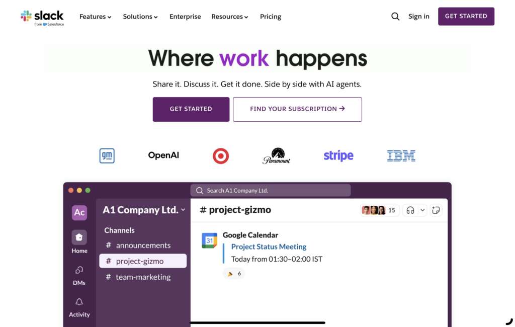
Why this design stands out:
- Bright, inviting colors: Slack’s playful and vibrant color scheme mirrors its fun yet professional brand personality.
- Clear product messaging: The design makes it easy to understand Slack’s value proposition with concise messaging that highlights key benefits.
- Interactive product tour: Slack uses interactive walkthroughs to show users exactly how to use the app, enhancing the onboarding process.
- Intuitive layout: The homepage clearly guides visitors to important sections, such as pricing, features, and customer support, making it easy to explore.
- Consistent brand identity: The use of consistent colors, typography, and visuals helps strengthen Slack’s brand identity, ensuring that users recognize the platform’s value immediately.
Takeaway for designers:
Slack’s design showcases the power of using bright, bold colors and interactive elements to create an engaging and fun user experience. It’s a perfect example of designing for a platform with a playful yet professional tone.
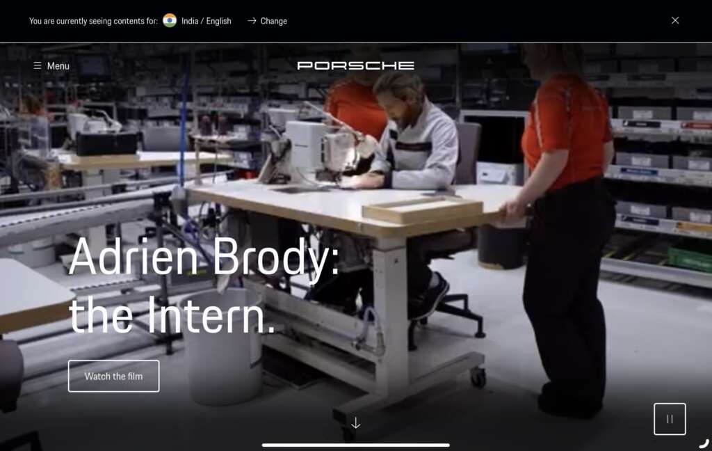
Why this design stands out:
- Luxury branding: Porsche’s website design mirrors its luxury car identity with sleek, sophisticated visuals and minimalistic design choices.
- High-quality images and videos: The website showcases the cars with ultra-high-definition images and cinematic video, offering an immersive experience.
- Interactive 3D models: Users can interact with detailed 3D car models, exploring different angles and features of the vehicles, creating a dynamic and personalized experience.
- Clear focus on product: Every element of the site is designed to highlight Porsche’s vehicles, making sure the cars take center stage.
- Responsive design: The website adapts beautifully across devices, maintaining high-quality visuals and interactive features on all screen sizes.
Takeaway for designers:
Porsche’s website exemplifies how interactive, high-quality visuals and a user-focused design can elevate a luxury brand. It teaches designers to prioritize a clean aesthetic while ensuring the product is the focal point through immersive experiences.
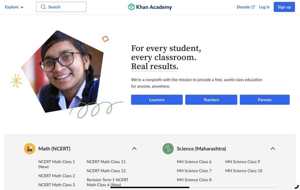
Why this design stands out:
- Engaging user interface: Khan Academy uses bright colors and engaging visuals to create a welcoming, educational environment.
- Clear and structured content: The website presents its educational content in a structured, easy-to-navigate layout, making learning simple and organized.
- Personalized experience: Users are encouraged to track their learning progress, which adds a personal touch to the design.
- Interactive lessons: Khan Academy incorporates interactive elements, such as quizzes and progress trackers, that help reinforce learning.
- Focus on accessibility: The website is designed to be inclusive, ensuring that all users, regardless of device or learning style, can easily access and benefit from the content.
Takeaway for designers:
Khan Academy’s design is a great example of how an educational platform can be both engaging and functional. Designers can learn how to balance content-heavy designs with a simple, accessible user experience that encourages interactivity and engagement.
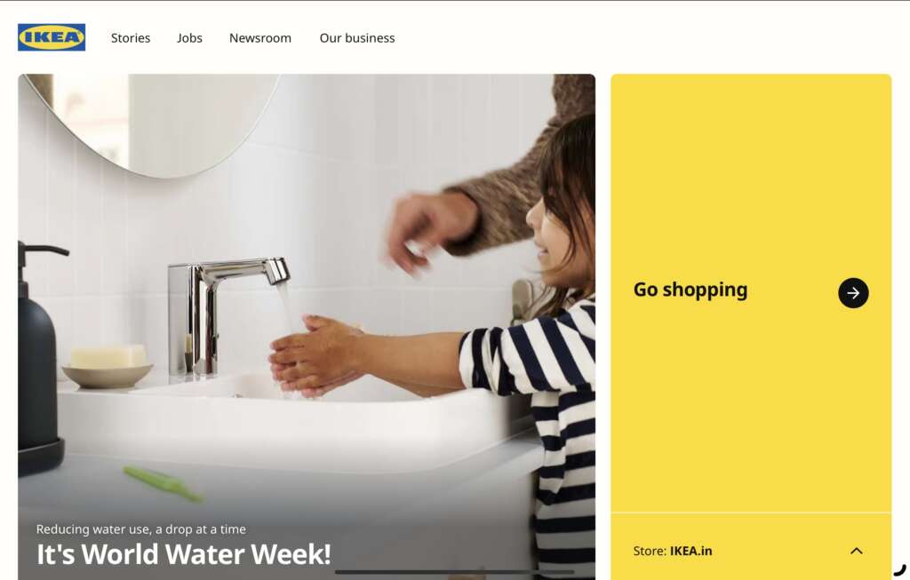
Why this design stands out:
- Clean, modern aesthetic: Ikea’s website embraces a minimalist design with ample white space, allowing products to take center stage.
- Easy-to-use navigation: With clear, straightforward menus, users can easily browse the vast selection of home goods without feeling overwhelmed.
- Product-focused imagery: Large, high-quality images of products showcase Ikea’s offerings, helping customers visualize them in their homes.
- Seamless checkout process: The website’s clean design extends to the checkout process, ensuring a smooth and hassle-free experience for customers.
- Mobile optimization: The design is fully responsive, ensuring that shoppers have a consistent experience whether shopping on desktop or mobile.
Takeaway for designers:
Ikea’s website highlights the importance of designing for both functionality and aesthetics. It shows how an intuitive, easy-to-navigate design can enhance the shopping experience while maintaining a strong brand identity.
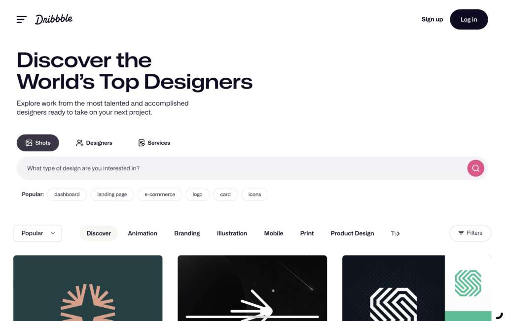
Why this design stands out:
- Showcase of creative work: Dribbble’s website provides a platform for designers to showcase their work in a clean, visually appealing gallery layout.
- Social networking features: The design incorporates social networking features such as likes, comments, and project sharing, fostering community engagement.
- Sleek, modern interface: The site uses a contemporary, minimalist design that enhances the focus on the creative work of its users.
- Interactive user profiles: Designers can create profiles, follow other creators, and easily navigate through their portfolios and design inspirations.
- Seamless mobile experience: The site is optimized for mobile, offering the same fluid, interactive experience as the desktop version.
Takeaway for designers:
Dribbble’s design is a prime example of how to build a platform that caters to creatives while ensuring ease of use. The minimalist approach to layout and the emphasis on interactivity provide valuable insights for designers looking to create user-centered platforms.

Why this design stands out:
- Prestigious branding: The Harvard website reflects the university’s prestigious reputation with a refined, professional design that uses rich imagery and classic typography.
- User-friendly navigation: The design is intuitive, with clear sections for admissions, research, and campus life, allowing potential students to easily find what they need.
- Focus on academic excellence: The website highlights Harvard’s key features and initiatives through compelling visuals and carefully curated content.
- Interactive elements: Interactive maps, virtual tours, and easy-to-navigate directories engage users and provide immersive experiences.
- Mobile compatibility: The website ensures a smooth experience on mobile devices, with responsive layouts and touch-friendly elements.
Takeaway for designers:
Harvard’s website is a perfect blend of prestige and functionality. Designers can learn how to maintain a formal, high-quality aesthetic while ensuring the website is accessible, engaging, and user-friendly.
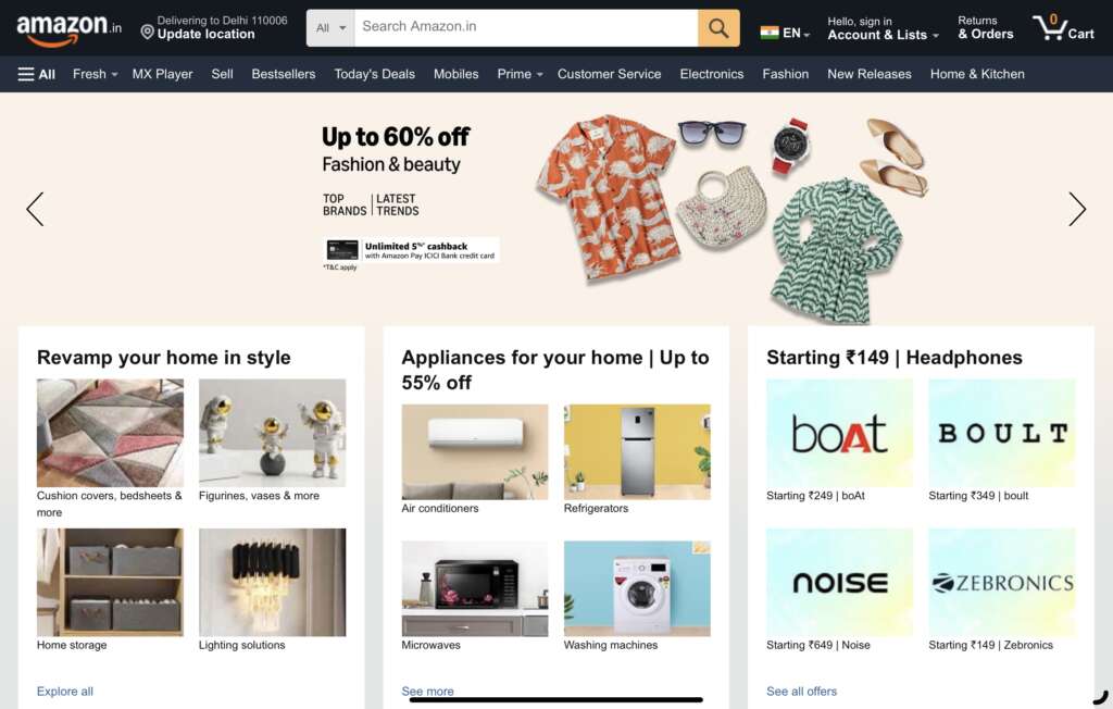
Why this design stands out:
- Focused product discovery: Amazon’s website is designed for one purpose—making it easy for users to find and buy products. Its search functionality is robust, with filters and suggestions that help guide the user experience.
- Clear product presentation: Each product page is cleanly organized with high-quality images, reviews, and detailed product descriptions.
- User-generated content: The integration of user reviews and ratings adds a social proof element that helps customers make informed decisions.
- Personalized recommendations: Amazon’s website leverages user data to offer personalized product suggestions based on browsing history, which enhances user engagement.
- Simple and fast checkout process: Amazon’s simple, secure, and fast checkout process makes it easy for customers to complete purchases with minimal friction.
Takeaway for designers:
Amazon’s design is a lesson in simplifying the online shopping experience. The focus is on making the user’s journey as efficient as possible, from discovering products to completing the purchase, with personalized touches along the way.
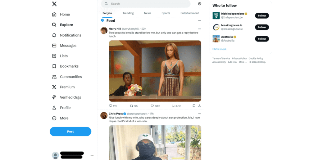
Why this design stands out:
- Real-time engagement: X’s website facilitates instant communication, with its clean, concise design encouraging quick interactions.
- Streamlined interface: The design is minimal, which lets the content—tweets—take center stage. This makes it easy for users to scroll and engage without distractions.
- Interactive elements: X uses dynamic, interactive features such as notifications, trending topics, and real-time updates, making the website highly engaging.
- Mobile-first approach: The website’s design is responsive, ensuring that mobile users have a fluid, optimized experience.
- Clear visual hierarchy: Important features like tweets, trends, and messages are prioritized, and the design allows for easy navigation between them.
Takeaway for designers:
X’s website shows the value of prioritizing content and interaction. By focusing on simplicity and real-time engagement, it allows users to easily interact and stay updated. Designers can take away the importance of clear visual hierarchy and interactive elements in creating engaging platforms.
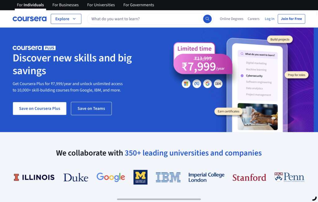
Why this design stands out:
- Course-centric layout: Coursera’s design focuses on showcasing educational content, making it easy for users to browse and find relevant courses.
- User-focused navigation: The site offers intuitive menus and filters, making it simple to search for courses based on topics, skills, and other preferences.
- Engaging visuals and icons: The design includes engaging visuals, such as course images and badges, that make learning more visually appealing.
- Clear call-to-action: The prominent “Enroll Now” button and other CTAs are easily accessible, encouraging user actions throughout the site.
- Student reviews: Each course page includes student reviews and ratings, helping potential learners make decisions about enrolling.
Takeaway for designers:
Coursera’s design emphasizes how educational platforms can engage users by focusing on course content and user feedback. It also demonstrates how to use visuals and interactive elements to guide users through their learning journey.
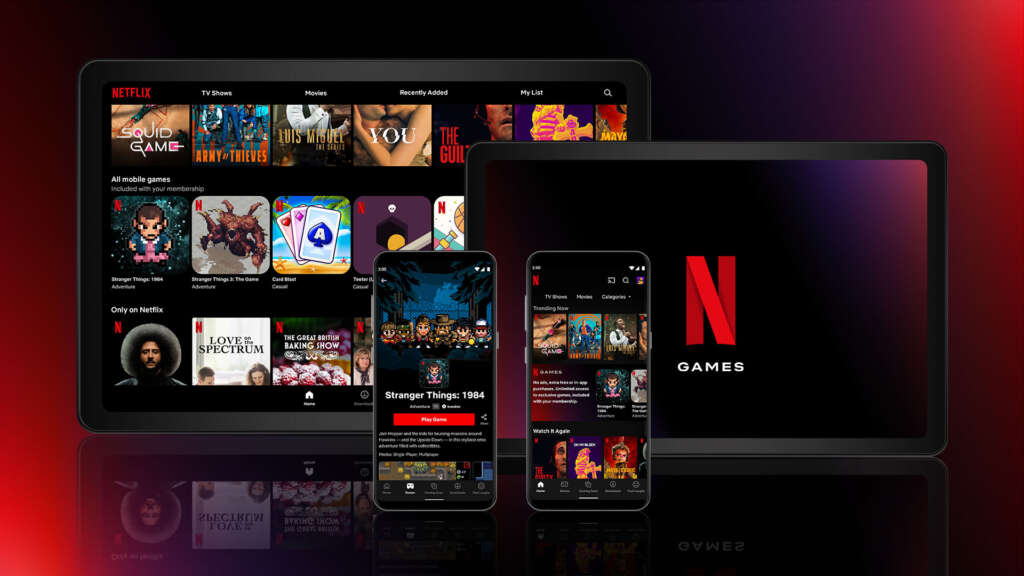
Why this design stands out:
- Binge-worthy user experience: Netflix’s homepage design is tailored to keep users engaged, offering personalized content recommendations and easy access to new shows.
- Full-screen visuals: Netflix uses large visuals, such as cover art and trailers, to entice users and provide a visual preview of the content.
- Efficient search: The search bar is simple yet powerful, enabling users to quickly find their favorite shows and movies.
- Seamless streaming experience: Once a user selects content, the website provides smooth streaming and playback options, with no interruptions.
- Responsive design: Netflix ensures a consistent and high-quality experience across all devices, whether on a smart TV, laptop, or mobile phone.
Takeaway for designers:
Netflix’s design focuses on a smooth, immersive experience that keeps users engaged for long periods. Designers can learn how to create highly personalized experiences and optimize user interactions for entertainment platforms.
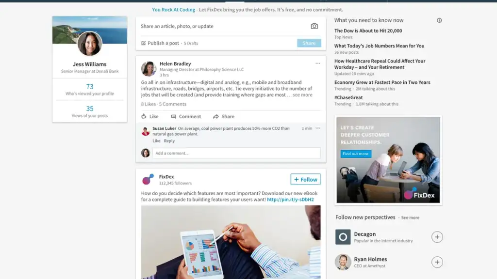
Why this design stands out:
- Professional networking: LinkedIn’s website is designed to foster professional connections, with a clean, business-oriented layout.
- Easy-to-navigate job search: The website’s job search functionality is user-friendly, with filters for job titles, locations, and industries, making it easier for users to find relevant opportunities.
- Profile-centered design: The site focuses on users’ profiles, allowing them to showcase their experience, skills, and endorsements.
- Interactive communication tools: LinkedIn integrates messaging and notifications, allowing users to stay updated on job opportunities and connections.
- Dynamic content: Personalized content such as updates from connections, companies, and groups keeps users engaged and informed.
Takeaway for designers:
LinkedIn’s website teaches designers how to create platforms that focus on personal branding and professional networking. It highlights the importance of clean design, personalized experiences, and interactive communication features.
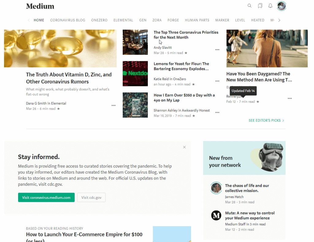
Why this design stands out:
- Minimalist writing platform: Medium’s website features a clean, minimalist design that puts the focus on reading and writing.
- Distraction-free reading experience: The site’s layout ensures that the content is front and center, with minimal distractions around it.
- User-friendly publishing tools: Medium offers an intuitive interface for writers to create and publish their articles without any complex formatting tools.
- Interactive engagement: Users can easily like, comment, and share articles, fostering a community of interaction around the content.
- Responsive and mobile-friendly: Medium’s website adapts well to mobile devices, ensuring readers have an excellent experience across all platforms.
Takeaway for designers:
Medium is an excellent example of how to design a content-focused website with minimal distractions. Its clean, simple layout and focus on readability show how to create a platform where users can easily consume content.
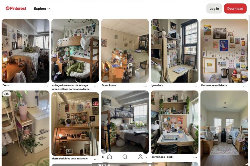
Why this design stands out:
- Visual-centric design: Pinterest’s website is built around visual content, with large images and pins that encourage users to explore and save ideas.
- Intuitive navigation: The site’s use of grid layouts and clear categories makes it easy for users to find inspiration and discover new content.
- Interactive elements: Pinterest allows users to create boards, save pins, and share content, adding a layer of interaction that deepens user engagement.
- Personalized content: Pinterest uses algorithms to personalize the feed, showing users content based on their preferences and interests.
- Responsive design: Pinterest’s design is optimized for mobile and desktop devices, ensuring a seamless browsing experience.
Takeaway for designers:
Pinterest’s design shows how to use visual content as the main focus of a website, creating a space for users to explore, engage, and personalize their experience. It also demonstrates the power of grid-based layouts and interactive elements in driving user participation.
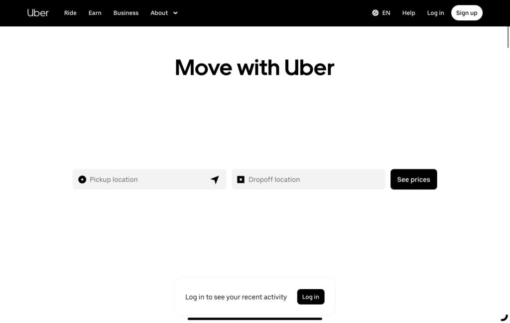
Why this design stands out:
- Efficient design for quick service: Uber’s website design is optimized to guide users toward their goal — booking a ride — as quickly and easily as possible.
- Strong focus on usability: The homepage features a simple, clean layout with a clear call to action: “Sign up” or “Get a ride” — making it easy for users to take action without confusion.
- Clear value proposition: Uber’s design immediately communicates the brand’s key promise — affordable and convenient transportation — through concise messaging and intuitive visuals.
- Engaging imagery: The use of vibrant images from various cities worldwide helps users envision using the service, providing an emotional connection to the brand.
- Mobile-first approach: Given Uber’s mobile app-first model, the website is designed to mirror the app experience, ensuring a consistent user journey across platforms.
Takeaway for designers:
Uber’s design highlights the importance of usability and quick access to key services. Designers can learn how to create a seamless, fast experience for users while maintaining a visually appealing, straightforward design.
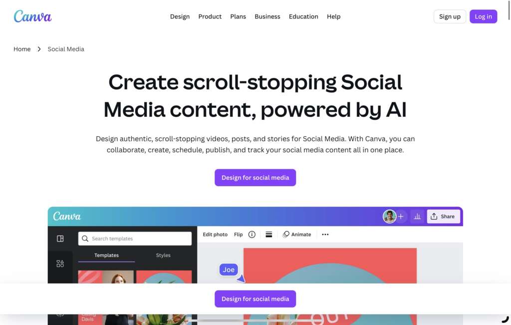
Why this design stands out:
- Creative and inviting interface: Canva’s website uses vibrant colors and playful design elements that match its creative brand identity, making it an appealing tool for users.
- User-friendly navigation: The site’s intuitive navigation and categorization make it easy for users, both beginners and experienced designers, to quickly find the tools and templates they need.
- Emphasis on call-to-actions: Prominent CTAs such as “Create a Design” or “Sign Up Free” are strategically placed to guide the user toward taking action without feeling overwhelmed.
- Interactive demo: Canva lets users immediately start creating or exploring templates without having to sign up, making the site more accessible and encouraging engagement.
- Mobile-optimized: The design works flawlessly across devices, providing users with the same rich experience regardless of whether they’re on desktop, tablet, or mobile.
Takeaway for designers:
Canva’s website is a great example of how to design a platform that caters to creative users while ensuring ease of use. The playful aesthetic paired with user-centric navigation is a winning formula for encouraging engagement.
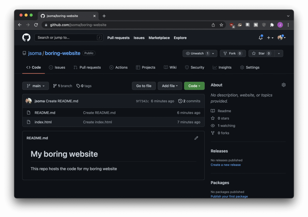
Why this design stands out:
- Focused on developers: GitHub’s website has a developer-first approach, using simple typography and a dark color scheme that’s familiar to its target audience.
- Clear project showcases: GitHub uses clear visuals and easily understandable project showcases to highlight open-source contributions, making it easy for users to explore repositories.
- Community-driven: The design encourages collaboration and interaction by displaying contributions, pull requests, and user profiles in an engaging manner.
- Prominent search functionality: GitHub’s robust search bar allows users to quickly find repositories, users, and code snippets, streamlining the user experience.
- Responsive layout: The website is fully responsive, ensuring that developers can access their code and projects efficiently on any device.
Takeaway for designers:
GitHub’s design emphasizes simplicity and functionality, with a focus on providing a seamless experience for developers. Designers can learn from GitHub’s approach to catering specifically to a niche audience while prioritizing user flow and navigation.
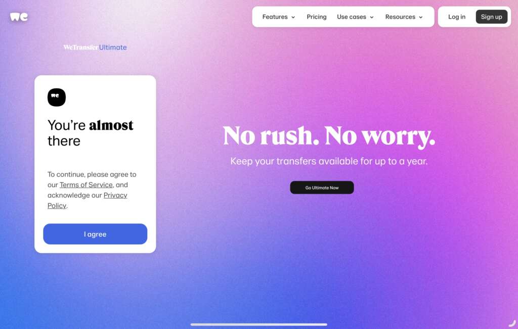
Why this design stands out:
- Straightforward user interface: WeTransfer’s website is clean and minimalist, guiding users directly toward file upload and sharing with little distraction.
- Focus on core service: The site’s layout prioritizes file transfers, making it clear what action the user should take without any clutter.
- Brand personality: The subtle use of playful elements and animations creates a friendly and approachable vibe while maintaining the professional functionality of the service.
- Seamless user flow: The user flow is intuitive, with just a few steps required to upload and share files, enhancing the overall experience.
- Mobile compatibility: WeTransfer’s design is responsive, ensuring that file transfers are just as seamless on mobile devices as on desktop.
Takeaway for designers:
WeTransfer demonstrates the power of minimalist design paired with a clear focus on functionality. By eliminating distractions and ensuring a straightforward, easy-to-understand user flow, the design maximizes usability.
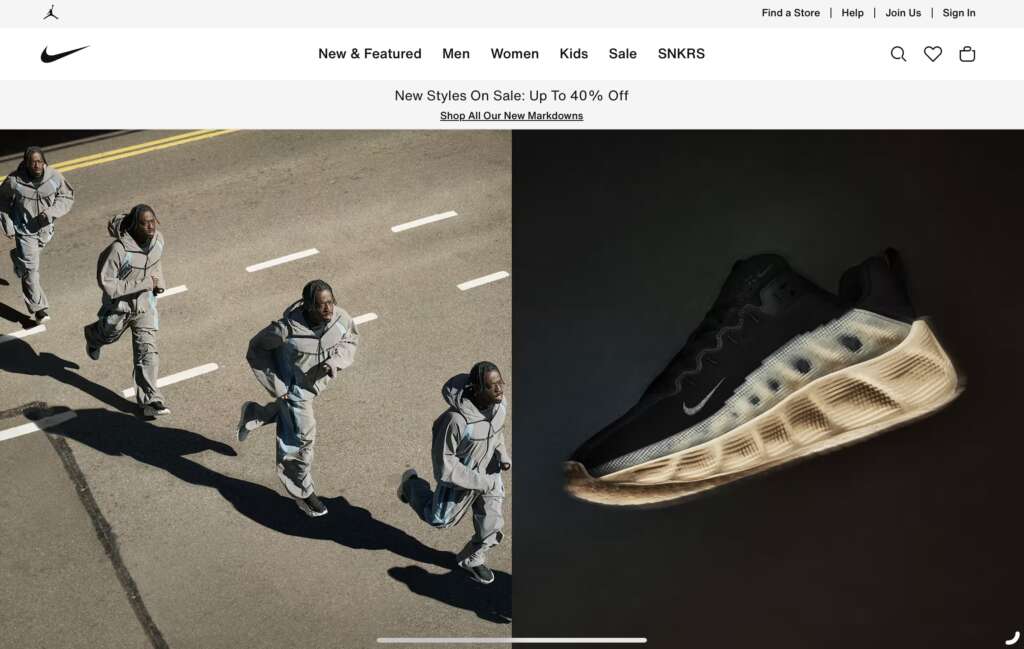
Why this design stands out:
- Bold, athletic aesthetic: Nike’s website reflects its high-energy, performance-driven brand with bold visuals, vibrant colors, and large typography that grabs attention.
- Product-centric layout: The site prominently showcases products in an easy-to-navigate grid format, making it simple for users to browse and shop.
- Strong visual storytelling: The use of striking images and videos of athletes and products creates an emotional connection with users, reinforcing the brand’s ethos.
- Clear CTAs: Nike’s website uses actionable buttons like “Shop Now” and “Explore More,” leading users toward their goals and making navigation easy.
- Responsive design: The site ensures that all features work flawlessly across devices, offering the same immersive experience on both desktop and mobile.
Takeaway for designers:
Nike’s website highlights how strong branding and visuals can come together to create a website that not only functions well but also emotionally resonates with the target audience. Designers can learn how to weave narrative storytelling with design to engage users.
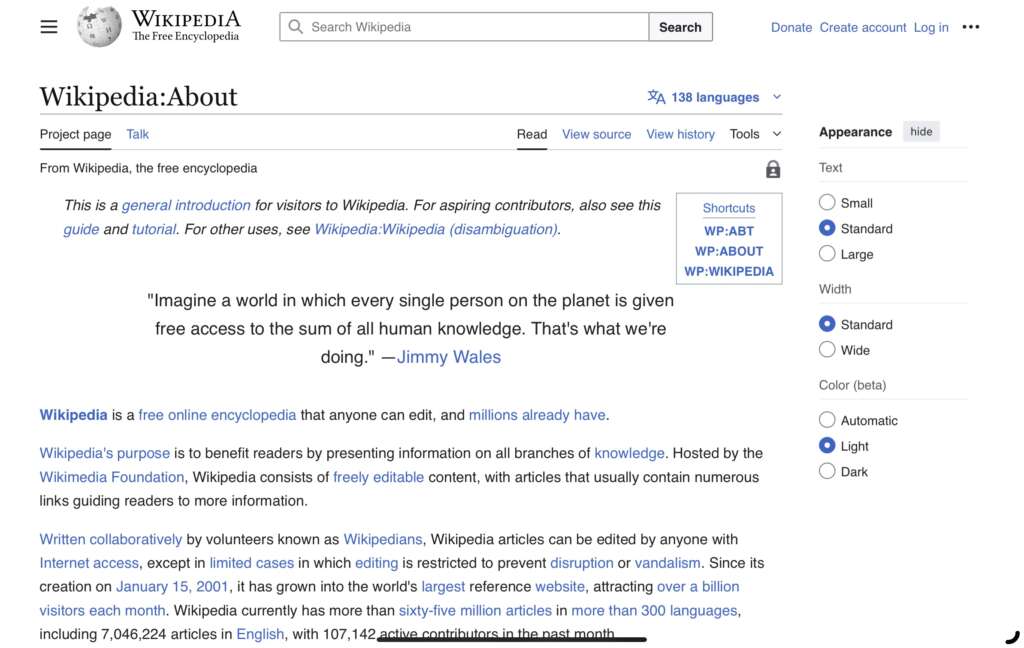
Why this design stands out:
- Clear, functional design: Wikipedia’s simple, text-heavy design places content at the forefront, ensuring that users can easily read and navigate articles.
- Focus on accessibility: The website’s design is optimized for users with disabilities, with features like adjustable font sizes and high-contrast color schemes.
- Simplicity in navigation: Wikipedia’s navigation is straightforward, with a search bar and links to related articles prominently displayed for easy exploration.
- Non-distracting layout: The minimalist design ensures that users can focus entirely on the content without unnecessary distractions.
- Mobile optimization: The mobile version of Wikipedia maintains the same focus on readability and ease of navigation, ensuring accessibility on all devices.
Takeaway for designers:
Wikipedia’s design teaches the importance of prioritizing content over visual design. For content-heavy websites, simplicity, readability, and accessibility are essential in creating a positive user experience.
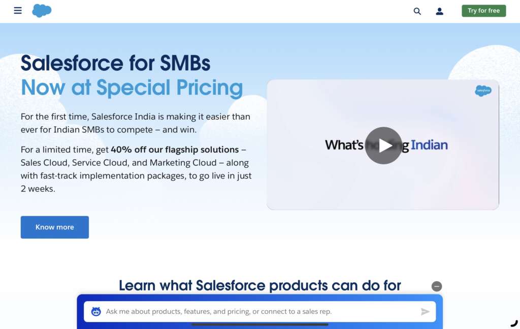
Why this design stands out:
- Business-focused design: Salesforce’s website is tailored to its enterprise clientele, with a professional layout that emphasizes trust and credibility.
- Clear product messaging: The website clearly communicates Salesforce’s product offerings, breaking down complex CRM tools into easy-to-understand solutions.
- Interactive product demos: Salesforce uses interactive demos and free trials, which allow users to explore their products before committing.
- Strategic use of color: The clean white background with blue accents reinforces Salesforce’s professional and trustworthy brand identity.
- Easy navigation: The site’s navigation is intuitive, allowing users to quickly find solutions, services, and product features.
Takeaway for designers:
Salesforce’s website design shows how to communicate complex services in a user-friendly and clear manner. For enterprise-focused websites, a simple yet professional design, along with interactive product demos, can enhance user engagement and drive conversions.
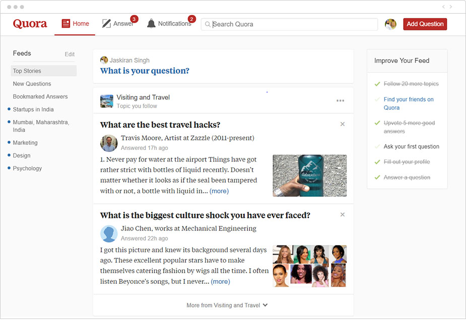
Why this design stands out:
- Clean and functional interface: Quora’s website prioritizes content—questions and answers—while maintaining a clean, easy-to-navigate interface.
- Engagement-driven layout: The site is designed to encourage users to ask and answer questions, with clear CTAs like “Answer” and “Follow.”
- Clear content categorization: The website categorizes questions by topic, allowing users to easily explore content that interests them.
- Social interaction: Quora’s design allows for easy interaction with the content, enabling users to upvote, comment, and follow specific topics or people.
- Responsive and mobile-friendly: The website is designed to perform well on both desktop and mobile devices, ensuring users can engage with the platform from any device.
Takeaway for designers:
Quora’s design is a great example of how to build a platform centered on user-generated content and engagement. By emphasizing content discovery and fostering interaction, it encourages users to participate, making the site more valuable to the community.
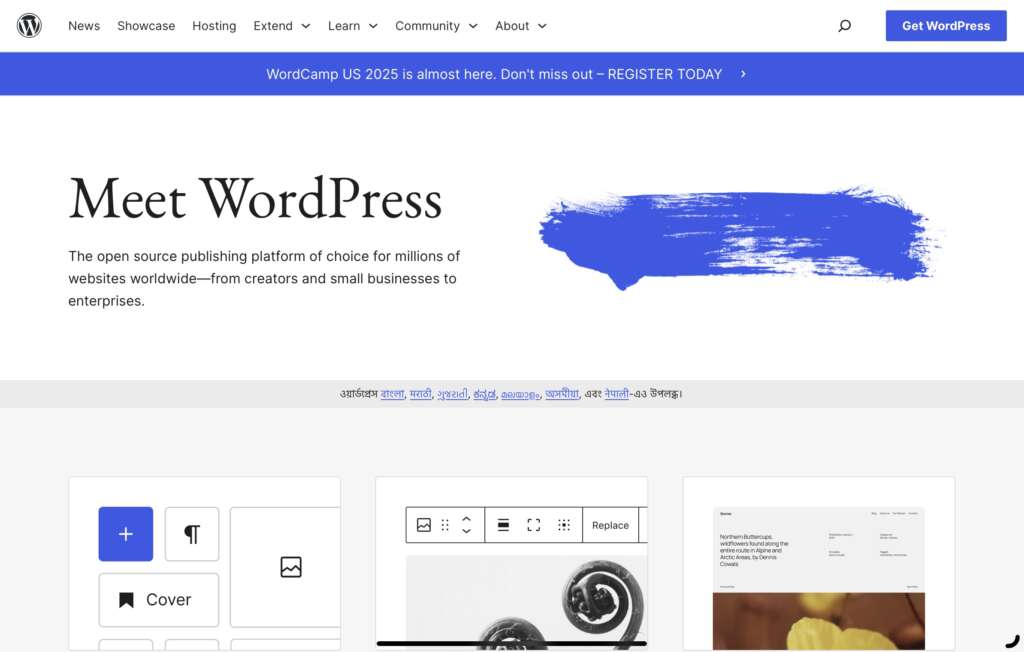
Why this design stands out:
- Clean, customizable design: WordPress’s website design is simple and flexible, offering customization options that allow users to personalize their experience.
- User-friendly navigation: The site’s interface is intuitive, making it easy for beginners and experienced users alike to navigate the platform and find the tools they need.
- Clear value proposition: The website clearly communicates its offering—creating and managing websites—through concise messaging and engaging visuals.
- Emphasis on community: WordPress integrates community-driven content, such as tutorials, forums, and blogs, fostering collaboration and engagement.
- Responsive design: WordPress’s design is optimized for mobile, providing a seamless experience across all devices.
Takeaway for designers:
WordPress’s website teaches the importance of simplicity and flexibility. By offering an intuitive, customizable interface, designers can create platforms that cater to a wide range of users, from beginners to experts, without compromising on functionality.
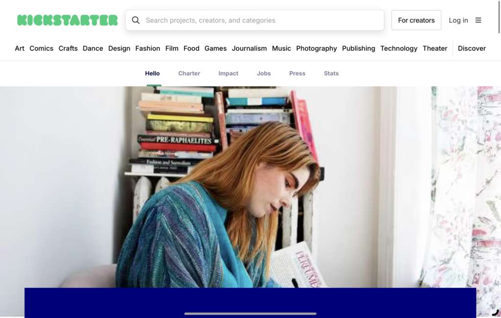
Why this design stands out:
- Engaging storytelling: Kickstarter’s design encourages creators to tell the story of their projects, using visuals and concise text to engage potential backers.
- Clear call to action: The design includes prominent CTAs such as “Back this project” and “Learn more,” guiding users through the platform’s key actions.
- Project-centric layout: The homepage is organized by categories and featured projects, allowing users to quickly find the projects that interest them.
- Community-driven elements: Kickstarter integrates backer reviews, updates, and social sharing buttons to help users engage with projects and creators.
- Mobile optimization: The website design is fully responsive, ensuring that backers and creators can easily interact with the platform on any device.
Takeaway for designers:
Kickstarter’s website shows how to combine storytelling with functionality. For crowdfunding platforms, it’s crucial to create a user-friendly experience that encourages engagement and simplifies the process of backing projects.
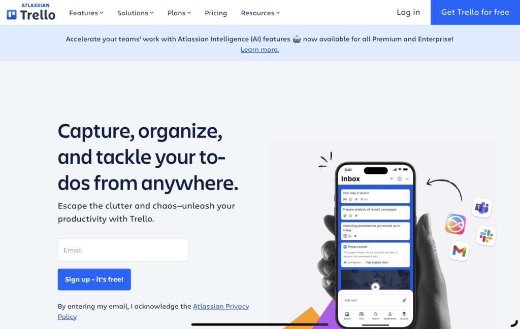
Why this design stands out:
- Simplicity and clarity: Trello’s design is clean and straightforward, allowing users to quickly understand how to use the tool with minimal learning curve.
- Interactive user interface: The website uses interactive elements such as drag-and-drop cards and lists to demonstrate Trello’s core features.
- Collaborative design: The platform encourages teamwork by displaying features that enhance collaboration, such as team boards and shared workspaces.
- Clear value proposition: Trello’s site clearly communicates how it helps users organize and manage projects, with a focus on simplicity and ease of use.
- Responsive and mobile-friendly: The design adapts beautifully to mobile devices, ensuring that users have a seamless experience across platforms.
Takeaway for designers:
Trello’s website design highlights the importance of simplicity and interactivity in task management tools. Designers can learn how to build intuitive user interfaces that allow users to quickly grasp functionality while maintaining flexibility.
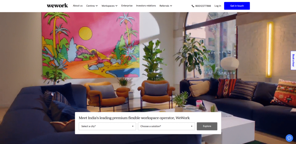
Why this design stands out:
- Visually engaging: WeWork’s website uses dynamic visuals, such as high-quality images and videos, to showcase its workspaces and the community it creates.
- Clear user journey: The design guides users through a smooth journey of exploring available spaces, booking tours, and joining the WeWork community.
- Interactive space locator: The site includes an interactive map that helps users find office spaces by location, making the process of finding and booking a workspace intuitive.
- Brand consistency: WeWork uses its brand colors and typography consistently throughout the site, ensuring a cohesive brand experience.
- Responsive design: The website performs well on all devices, ensuring that users can easily explore spaces and book meetings regardless of whether they are on desktop or mobile.
Takeaway for designers:
WeWork’s design demonstrates how a website can promote a physical service by using visuals and interactive elements that highlight the brand’s core offerings. It also shows how to use responsive design to ensure a seamless user experience on any device.
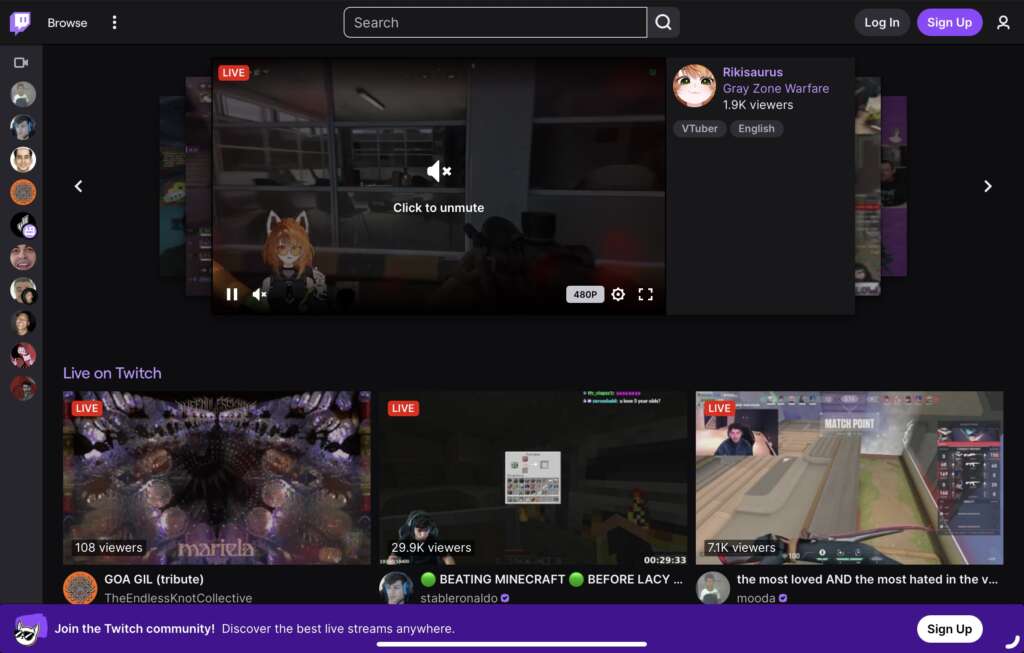
Why this design stands out:
- User-centric layout: Twitch’s website design is focused on providing a personalized experience for both streamers and viewers, with content suggestions based on user preferences.
- High-impact visuals: The website uses bold images, live streams, and dynamic content to capture the audience’s attention immediately.
- Real-time engagement: As a live-streaming platform, Twitch’s design allows users to engage with content in real-time through chat features, reactions, and notifications.
- Clear navigation: The website’s layout is intuitive, with easy-to-access categories for streams, games, and channels.
- Mobile-friendly design: Twitch’s design ensures a seamless experience across all devices, offering a consistent layout and functionality from desktop to mobile.
Takeaway for designers:
Twitch’s website highlights the importance of live, real-time interactions in design. For platforms centered around live content, it’s essential to create a design that emphasizes engagement and community, offering users easy access to their interests and interactions.
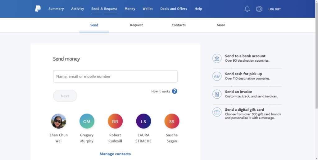
Why this design stands out:
- Secure, trustworthy design: PayPal’s website conveys trust with its clean, professional layout, featuring a blue and white color scheme that evokes confidence and security.
- Simple user flow: The website focuses on simple actions like sending money, receiving payments, and checking account balances, with easy navigation and minimal steps.
- Clear value proposition: PayPal’s design communicates its value clearly, emphasizing the speed, security, and convenience of online payments.
- Interactive features: The website incorporates interactive elements such as payment calculators and sign-up forms, enhancing usability.
- Mobile optimization: PayPal’s design is optimized for mobile devices, ensuring users can complete transactions quickly and securely on the go.
Takeaway for designers:
PayPal’s website design shows the importance of creating a trustworthy and secure online experience, especially for financial platforms. A clean, simple layout and interactive features can help users navigate easily and make payments with confidence.
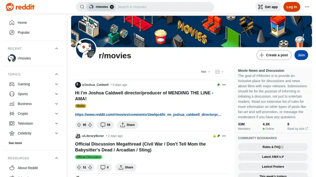
Why this design stands out:
- Community-focused design: Reddit’s website is designed to encourage user participation, with an emphasis on discussions, upvotes, and interactions.
- Clean and simple layout: The website uses a straightforward, no-frills layout that keeps the focus on the content—posts, comments, and discussions.
- Personalized content: Reddit uses algorithms to show users content based on their interests, making the user experience highly personalized and engaging.
- Engaging features: The website includes interactive elements like comments, voting, and user-created content, making it a dynamic and engaging platform.
- Mobile-friendly design: Reddit’s website is fully responsive, ensuring that users have a smooth experience regardless of the device they’re using.
Takeaway for designers:
Reddit’s website is a prime example of how to create a platform centered around user-generated content and community engagement. Designers can learn how to use simple layouts and personalized content to foster an interactive experience.
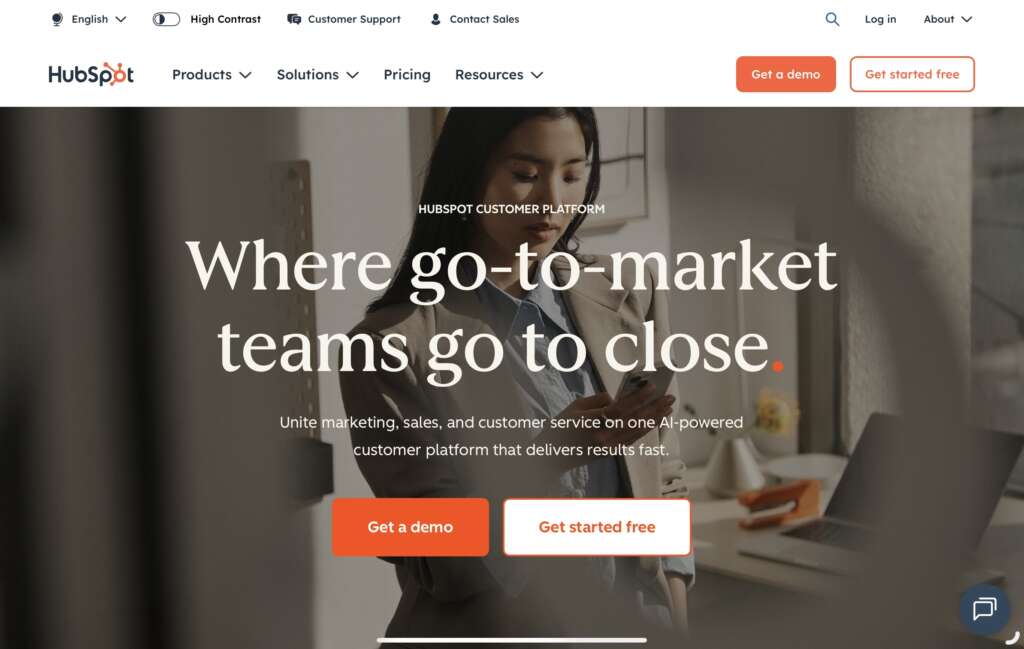
Why this design stands out:
- Conversion-centric design: HubSpot’s website is designed to drive conversions, with clear calls to action, such as “Get started free” and “Request a demo.”
- Educational content: The site focuses on providing value through educational resources like blogs, guides, and webinars that help visitors learn about inbound marketing.
- User-friendly navigation: The website’s layout is simple and organized, with easy access to product features, pricing, and support.
- Engaging visuals: HubSpot uses a mix of high-quality images, videos, and infographics to break down complex marketing concepts.
- Responsive design: The website is optimized for mobile and desktop, ensuring a seamless experience across all devices.
Takeaway for designers:
HubSpot’s website shows how to effectively design a platform that combines educational content with clear calls to action. The focus on conversion and providing value to the user makes it a strong example of a lead-generation website.
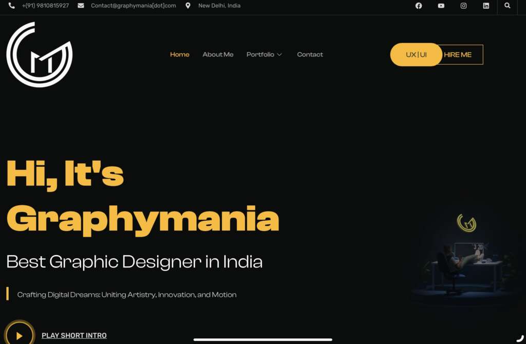
Why this design stands out:
Minimalist Approach: Graphymania employs a clean, minimalist design that prioritizes content, ensuring that articles and tutorials are the focal point.
Typography and Layout: The site utilizes modern typography and a well-structured layout, enhancing readability and user engagement.
Interactive Tutorials: Interactive elements, such as embedded design tools and live previews, are integrated into tutorials, allowing users to experiment and learn in real-time.
Takeaway for designers:
Graphymania’s website serves as an excellent example of how a minimalist design can effectively showcase content, while interactive elements and community features enhance user engagement and learning.
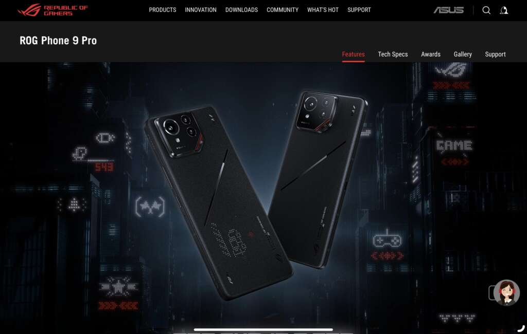
Why this design stands out:
Futuristic Aesthetics: The website boasts a sleek, all-black design with a blend of glossy and matte finishes, exuding a futuristic and sophisticated vibe. The matte finishes are crafted with a crystalized nano-texture for a silky touch and fingerprint-free surfaces.
Interactive Elements: Features like the AniMe Vision display on the back of the device are highlighted with interactive animations, allowing users to visualize the customizable LED patterns and their functionalities.
Product-Centric Layout: The site employs a clean, product-focused layout with high-quality images and videos, emphasizing the ROG Phone 9 Pro’s features and performance capabilities.
Responsive Design: Optimized for various devices, ensuring a seamless experience whether accessed via desktop, tablet, or mobile.
Takeaway for designers:
The ROG Phone 9 Pro’s website effectively combines sleek aesthetics with interactive elements, providing users with an immersive experience that mirrors the product’s innovative features.
Conclusion
By analyzing these 50 best website designs, it’s clear that great websites share certain qualities: intuitive navigation, engaging visuals, and a clear focus on user experience. Whether you are designing a product-centric platform like Nike, a community-driven site like Reddit, or a business-focused website like HubSpot, the key is to create a design that is not only aesthetically pleasing but also highly functional and user-friendly. Each example showcases valuable lessons in balancing form and function to build websites that users love to engage with.
"Great web design is not just about aesthetics—it’s about creating an experience that guides the user effortlessly toward their goal. From simple layouts to complex, interactive designs, the key is functionality and engagement."

MOHD ARMAN
FAQs
1. What are the most important factors in good website design?
The key elements of good website design include clean aesthetics, intuitive navigation, responsive layout, and fast loading times. Prioritizing user experience while keeping content easily accessible is critical.
2. How do I choose the right design for my website?
When choosing a design for your website, consider your brand, your target audience, and the goals of your site. Your design should reflect your brand’s identity while making it easy for users to navigate and take action.
3. What are the latest web design trends?
Some of the latest web design trends include minimalist design, dark mode, immersive 3D visuals, AI-driven personalization, and interactive user experiences. These trends aim to make websites more engaging and user-friendly.
4. Why is web design important for businesses?
Web design plays a crucial role in shaping a business’s online presence. A well-designed website can improve user engagement, increase conversions, and enhance brand credibility. It creates a strong first impression and serves as a central hub for your digital marketing efforts.
Looking to build your own sleek modern website?
Graphymania helps brands design functional, creative, and professional websites that convert.