
UX UI Design for Fintech onboarding is often the first real conversation between a user and a digital financial product. And because first impressions matter, a confusing or slow onboarding flow can irritate and quickly push users away. In fact, many users abandon a banking app within the first few minutes if the process feels unclear or demanding. Therefore, fintech application onboarding must be simple, fast, and reassuring from the very first screen.
At Graphymania, we design onboarding experiences that help financial institutions, financial banks, and corporate banking platforms reduce drop-off and build trust early.
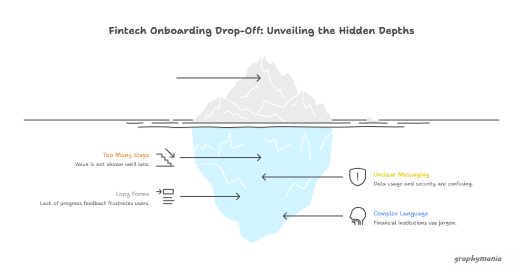
Why Fintech Onboarding Has High Drop-Off Rates
Fintech onboarding fails not because users lack interest, but because the experience often feels risky or tiring. Users are sharing sensitive data, and they want security, clarity, and control.
Common reasons for drop-off include:
Too many steps before the value is shown
Unclear data usage and security messaging
Long forms without progress feedback
Complex language used by financial institutions
However, when onboarding is designed with empathy, users feel confident and stay engaged. As a result, conversion rates improve across rates banks and modern digital banking applications.
The Role of UX UI Design in Fintech Onboarding
Strong UX UI Design for Fintech focuses on reducing effort while increasing confidence. It guides users gently, explains why information is needed during onboarding, and shows progress clearly.
Good onboarding design:
Breaks tasks into small, manageable steps
Uses friendly microcopy instead of formal banking terms
Shows progress indicators so users know what’s next
Highlights security and compliance without fear
Because users trust what they understand, clear design directly improves onboarding completion for financial banks and corporate banking platforms.
Key UX UI Design Principles That Reduce Drop-Off
1. Show Value Before Asking for Data
Users are more willing to share information when they understand what they will get. For example, showing account benefits or features early keeps users motivated.
2. Simplify Forms and Inputs
Long forms increase friction. Therefore, use:
Smart defaults
Inline validation
Auto-fill where possible
This approach works especially well for banking apps targeting mobile-first users.
3. Build Trust Visually
Trust is critical in fintech. Use:
Clear security messages
Familiar UI patterns from trusted rates banks
Consistent colors and typography
As a result, users feel safe moving forward.

Designing Onboarding for Different Fintech Segments
Not all fintech users come with the same goals, urgency, or expectations. Therefore, onboarding that works for one segment may fail badly for another. Let’s break this down using real-world fintech products and UX patterns.
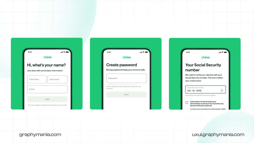
1. Retail Banking Application: Speed Comes First
Retail users usually open a banking app to solve an immediate need—checking balance, sending money, scanning UPI, or getting a card. Because of this, onboarding must feel fast and effortless.
How UX/UI supports this:
Phone number or email signup first
Minimal screens (3–5 steps max)
Soft KYC introduced after showing value
Friendly language and visual cues
Why it works:
Users see benefits early (card preview, dashboard glimpse), so they stay motivated to finish onboarding. As a result, drop-off stays low.
If this UX were used for corporate banking:
It would fail—business users need more control and detail upfront.
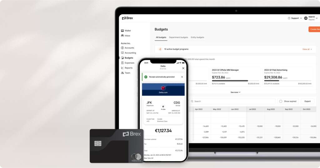
2. Corporate Banking: Clarity and Control Matter
Corporate banking users are not in a rush. However, they are highly cautious. They manage large sums, approvals, and teams, so onboarding must feel structured and predictable.
How UX/UI changes here:
Step-by-step setup with progress tracking
Clear explanation of documents and approvals
Role-based access setup during onboarding
Formal but simple language
Why it works:
Users feel informed and in control. Because expectations are set clearly, users trust the platform and complete onboarding without frustration.
If this UX were used for a retail banking app:
It would feel slow and overwhelming, increasing drop-off instantly.
3. Financial Institutions Serving Enterprises: Guided Depth
Enterprise-focused Banks & financial institutions deal with compliance-heavy onboarding. Users expect detail, but they still need guidance.
How UX/UI handles this balance:
Modular onboarding (setup now, configure later)
Tooltips and inline help instead of long text
Sandbox or demo mode before full activation
Clear timelines for approvals and integrations
Why it works:
Enterprise users understand complexity, but good UX prevents cognitive overload. As a result, onboarding feels manageable instead of intimidating.
Therefore, UX UI design should adapt tone, steps, and visuals based on user intent. A one-size-fits-all approach often increases drop-off.
Reducing Anxiety During KYC and Verification
KYC is necessary, but poor design makes it painful.
Good UX can reduce anxiety by:
Explaining why verification is required
Showing time estimates
Allowing users to save and return later
Meanwhile, friendly visuals and simple language help users stay calm. This is especially important for financial banks operating under strict compliance rules.
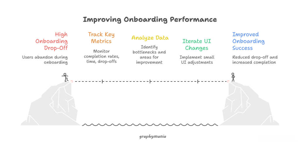
Measuring and Improving Onboarding Performance
Design does not end at launch. To reduce drop-off long-term, track:
Step-by-step completion rates
Time spent on each screen
Drop-off points during verification
Then, iterate continuously. Even small UI changes can significantly improve onboarding success for banking applications and rates banks.
Conclusion: Better Onboarding Starts with Better UX
In conclusion, UX UI Design for Fintech onboarding is not just about aesthetics. It is about clarity, trust, and momentum. When onboarding is simple and human, users feel confident, and drop-off rates fall.
At Graphymania, we help financial institutions, financial banks, and corporate banking platforms design onboarding journeys that convert, retain, and build long-term trust. Because when users feel guided, they stay.
"Great fintech onboarding doesn’t ask for trust, it earns it screen by screen."

MOHD ARMAN
FAQs
1. What is fintech onboarding UX?
Fintech onboarding UX is the design of first-time user experiences in a banking app or financial platform, focusing on ease, clarity, and trust.
2. Why do users drop off during fintech onboarding?
Users drop off due to long forms, unclear steps, security concerns, or complex language used by financial institutions.
3. How does UX UI design reduce onboarding drop-off?
Good UX UI design simplifies steps, builds trust, and clearly communicates value, helping users complete onboarding confidently.
4. Is onboarding design different for corporate banking?
Yes. Corporate banking onboarding requires more structured flows, clearer explanations, and higher transparency due to complex user needs.
Still here?
Great. Share your goals, and Graphymania will help you design, test, and ship elegant interfaces with the Glass Effect — fast and on brand.