
Fintech UI Design is not just about how an app looks. It’s about how clearly it helps users finish one job; FAST.
And this is exactly why many of us never used Paytm, even though it was everywhere.
This story is not about failure.
It’s about focus, behaviour, and distribution, and how UX decisions shape habits in high-frequency fintech products.
The Payments App Job Is Simple
When users open a payments app, they want one thing:
| Pay fast. Don’t think.
That single expectation defines success in UPI-driven products. And because UPI is used daily, sometimes multiple times a day, clarity matters more than feature depth.
This is where Fintech UI Design becomes a competitive advantage, not just a design exercise.
Google Pay didn’t win because it had more features.
It won because it understood where and how users already lived.
- It came pre-installed on Android phones
- It borrowed Google’s brand trust
- And it made UPI feel safe, simple, and familiar
As a result, onboarding felt effortless.
And because users trusted Google, they didn’t hesitate.
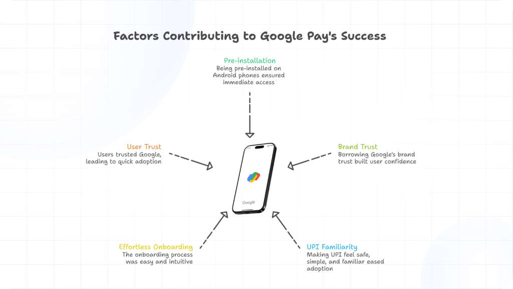
From a mobile payments UX perspective, this is textbook behaviour design: reduce doubt, reduce steps, reduce thinking.
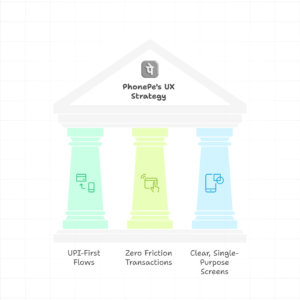
PhonePe’s Obsession with One Thing
PhonePe took a different but equally powerful route.
PhonePe obsessed over:
- UPI-first flows
- Zero-friction transactions
- Clear, single-purpose screens
There were no distractions.
No side missions.
And because the UI was designed around one core habit, users formed muscle memory quickly.
Meanwhile, repeated success reinforced trust.
This is a strong example of UPI app design best practices, where speed and predictability beat novelty.
Paytm’s Ambition: Powerful, but Heavy
Paytm wasn’t wrong.
In fact, its vision was bold.
- Paytm tried to be:
- A UPI app
- A wallet
- A shopping mall
- A movie ticket platform
- A travel app
- A financial services hub
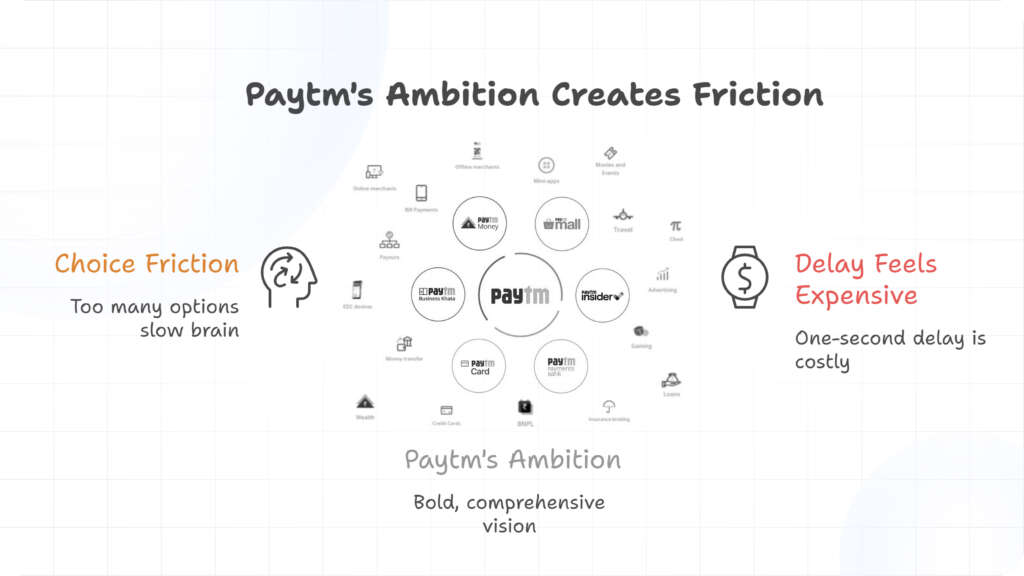
That’s impressive.
But in high-frequency apps, choice creates friction.
When users open a payments app and see too many options, the brain slows down.
And even a one-second delay feels expensive when the task is supposed to be instant.
From a fintech product UX lens, Paytm optimized for many jobs, while competitors optimized for one.
UPI Was a Behaviour Shift, Not a Feature
UPI didn’t just change payments.
It changed how often and how casually people paid.
For example:
- Paying friends
- Splitting bills
- Small daily transactions
These actions required speed, confidence, and zero learning curve.
Because of this shift, Fintech UI Design had to be invisible.
The best UI became the one users didn’t notice. And this is where focus beats ambition.
This behavior shift also explains why trust became a silent growth driver in UPI apps. When users pay multiple times a day, they rely on signals like clarity, predictability, and visual reassurance. This is why strong fintech product design focused on trust often outperforms feature-heavy platforms. As explored in detail in our blog on fintech product design and building trust through UX UI, users stay loyal to products that feel safe before they feel powerful.
Focus vs Expansion: The Core UX Lesson
For behavior-driven products, the rule is simple:
| Win the core habit first. Then expand.
Paytm tried to expand before locking the habit.
PhonePe and Google Pay locked the habit before expanding.
As a result:
- Users stayed where payments felt effortless
- And loyalty followed simplicity
This lesson applies far beyond fintech.
But in payments, the cost of confusion is immediate abandonment.
What Founders Can Learn From This
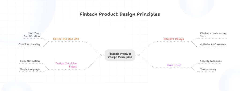
If you’re building a fintech product today:
- Define the one job your user opens the app for
- Remove everything that delays the job
- Design flows that work without explanation
- And earn trust before adding complexity
Because in daily-use products, clarity compounds faster than features.
For fintech founders and product teams, this highlights the importance of designing around real user behavior, not just business ambition. A focused approach to fintech UI design helps products earn daily usage before expanding into ecosystems. If you’re building or refining a payment-led product, explore our detailed guide on UI UX design for fintech products to understand how clarity, speed, and trust come together in high-frequency financial apps.
Conclusion: Fintech UI Design Is About Habit
In conclusion, Fintech UI Design is not about how many problems your app can solve. It’s about how clearly it solves the first one.
Paytm’s super-app strategy wasn’t stupid. But for UPI behaviour, it may have been too early.
And in products shaped by habit, focus almost always wins.
At Graphymania, we believe the strongest fintech products are built by first understanding human behavior and then designing around it. Whether it’s payments, lending, or financial platforms, thoughtful UX decisions shape long-term habits. Explore more insights, case studies, and practical design thinking on the Graphymania UX UI design blog.
"Win the habit first. Scale the product later"

MOHD ARMAN
FAQs
1. Why did PhonePe and Google Pay grow faster than Paytm?
Because they focused on one core behaviour, ‘fast UPI payments’, and removed friction from that experience.
2. Is the super-app model wrong for fintech?
Not wrong, but timing matters. Users must first trust and rely on the core feature before expansion works.
3. How does Fintech UI Design affect user behaviour?
Clear UI reduces thinking, builds confidence, and helps users repeat actions, which form habits.
4. What should fintech founders prioritize in UX?
Speed, simplicity, and predictability, especially for high-frequency actions like payments.