
A patient does not compare your healthcare app to another hospital’s app.
They compare it to Amazon, Google, and WhatsApp.
That is the new reality of Healthcare UX Design.
Whether you are building a telemedicine app, a hospital portal, or a chronic care management platform, expectations are high. Patients want speed. Clinicians want clarity. Administrators want compliance. And product teams are caught in the middle.
Healthcare is complex. But your user experience should not be.
This guide breaks down the essential layers of effective Healthcare UX Design, with practical examples for startups, product managers, and UX designers working in digital health.
The Three-Layer Framework for Modern Healthcare UX Design
UX Pilot is a next-gen platform that helps designers create seamless, intuitive, and impactful user experiences. It uses behavioral patterns and user journey data to streamline the UX/UI design process—making it easier for designers to make informed decisions.
Key Features of UX Pilot:
- Tracks real-time user behavior across apps and websites
- Offers design feedback and insights based on user engagement
- Helps define better workflows for product teams
- Integrates with design tools like Figma and Framer
- Generates heatmaps and usage patterns
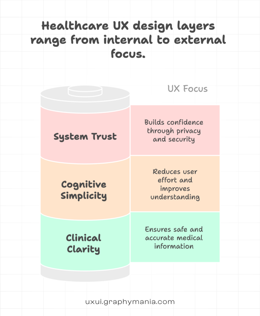
L1: Clinical Clarity - Design for Accuracy and Safety
In healthcare, confusion is not just inconvenient. It can be dangerous.
What Clinical Clarity Means
Clear labeling of medical terms
Logical information hierarchy
Reduced ambiguity in instructions
Visible alerts for critical data
Example
A diabetes management app showing blood glucose trends should:
Use clear units (mg/dL or mmol/L)
Highlight abnormal values in a distinct but accessible color
Provide plain-language explanations like:
“Your reading is higher than your target range.”
Avoid dense dashboards with 12 graphs. Clinicians need quick scanning. Patients need a clear interpretation.
In UX in Healthcare, safety-first design is non-negotiable.
L2: Cognitive Simplicity - Reduce Mental Load
Healthcare platforms often overwhelm users with:
- Forms
- Medical history inputs
- Insurance details
- Appointment options
Your job is to simplify the journey.
Break Down Complex Flows
Instead of a 20-field intake form, use:
- Progressive disclosure
- Multi-step forms with progress indicators
- Smart defaults (auto-fill city from PIN code)
- Contextual tooltips
Example
In a hospital patient portal:
Instead of showing “Radiology Reports,” “Pathology Reports,” and “Clinical Reports” as separate, confusing tabs, group them under:
“Your Test Results”
With filters like: Date | Department | Status
That small structural shift dramatically improves Healthcare User Experience.
L3: System Trust - Build Confidence Through Transparency
Healthcare users are sensitive about data.
Trust is built visually and functionally.
Trust Signals in Healthcare UX Design
Clear privacy notices near data input fields
Visible security badges
Downloadable medical records
Transparent appointment confirmations
Real-time status updates
Example
After booking a teleconsultation, instead of just showing:
“Appointment Confirmed”
Show:
Doctor’s name and specialization
Time zone clarity
Add to calendar button
Secure video link details
What to prepare before the session
Good Healthcare UX Design reduces anxiety before the appointment even begins.
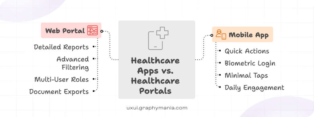
Apps vs Portals: Key Differences - healthcare UX Design
Healthcare apps and portals serve different behavioral contexts.
Mobile Healthcare Apps
Used for:
- Quick tasks
- Daily monitoring
- On-the-go bookings
Design priority:
- Speed & Minimal taps
- Thumb-friendly navigation
- Biometric login
Example: A medication reminder app should open directly to “Today’s Dose,” not a dashboard of analytics.
Healthcare UX Web Portals
Used for:
- Detailed reports
- Insurance documentation
- Administrative tasks
- Multi-role access (patient, caregiver, admin)
Design priority:
- Information architecture
- Advanced filtering
- Export functionality
- Accessibility compliance (WCAG)
Example: A hospital portal should allow a caregiver to switch between two family members’ records without logging out.
That is practical UX in Healthcare.
Accessibility in Healthcare UX is Not Optional
Healthcare audiences are diverse:
- Elderly users
- Visually impaired patients
- Non-native language speakers
- Users with motor challenges
Best practices:
- Minimum 16px body text
- High contrast ratios
- Voice input options
- Multilingual support
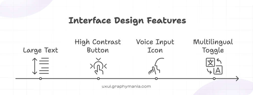
If your design excludes users, it fails – regardless of aesthetics.
Compliance-Aware Healthcare UX
Healthcare products operate within regulatory frameworks (HIPAA, GDPR, local health regulations).
Instead of adding compliance as an afterthought:
Design with it from day one.
Examples:
Auto-logout timers with clear warnings
Audit logs visible to admins
Role-based dashboards
Masked sensitive fields by default
Good Healthcare User Experience balances usability and legal requirements.
Data Visualization in Healthcare UX Design
Health data is emotional data.
Avoid:
- Overly clinical charts
- Red panic colors for minor variations
- Overcrowded dashboards
Use:
- Simple trend lines
- Clear baseline markers
- Calm color palettes
- Plain-language summaries
For example:
Instead of just showing a cholesterol graph, add:
“Your levels have improved 12% since June.”
That connects insight to motivation.
Designing for Multi-Stakeholder Systems
Healthcare systems often serve:
Patients
Doctors
Nurses
Lab technicians
Admin staff
Do not design one interface and “adjust” it later.
Create role-specific experiences from the start.
Example:
Doctor dashboard:
- Patient queue
- Lab alerts
- Quick prescription tools
Patient dashboard:
- Upcoming visits
- Test results
- Payment history
Different goals. Different design priorities.
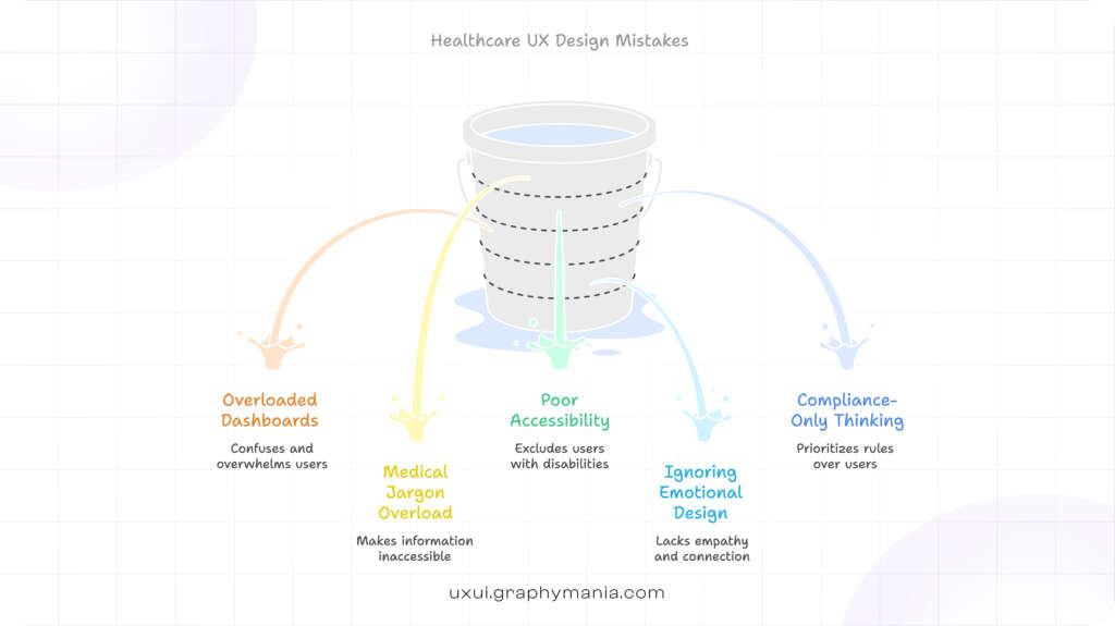
Common Mistakes in Healthcare UX Design
Overloading dashboards with metrics
Using medical jargon without explanation
Ignoring accessibility
Copying fintech UX patterns blindly
Designing for compliance only, not humans
Healthcare is not banking. Emotional stakes are higher.
The Strategic Shift: From Feature-Built to Experience-Driven
Healthcare platforms used to focus on:
“What features do we need?”
Modern leaders ask:
“What experience reduces friction and builds trust?”
For startups and product managers, this shift matters.
Because adoption in digital health is not driven by features alone.
It is driven by confidence, clarity, and usability.
That is the core of strong Healthcare UX Design.
Conclusion: The Future of Healthcare UX Design
From mobile health apps to enterprise hospital portals, the standard for digital care has changed.
Users expect:
Speed without confusion
Transparency without overload
Compliance without friction
Effective Healthcare UX Design blends clinical accuracy, cognitive simplicity, and system trust into one seamless experience.
For startups and product teams building in health tech, UX is no longer a surface-level decision. It is a strategic advantage.
At Graphymania, we design it thoughtfully – because in healthcare, experience impacts outcomes.
"In healthcare, experience is not decoration. It directly shapes trust, adoption, and outcomes."

MOHD ARMAN
FAQs
1. What is Healthcare UX Design?
Healthcare UX Design focuses on creating safe, accessible, and user-friendly digital experiences for patients, clinicians, and healthcare administrators.
2. Why is UX important in Healthcare platforms?
Good UX in Healthcare reduces errors, improves patient engagement, builds trust, and increases platform adoption.
3. How is Healthcare User Experience different from other industries?
Healthcare involves sensitive data, medical accuracy, regulatory compliance, and emotional decision-making, making usability more critical and complex.
4. What are key elements of good Healthcare UX Design?
Clinical clarity, cognitive simplicity, accessibility, compliance awareness, and trust-building features are essential components.
5. How can startups improve Healthcare UX early on?
Start with user research, simplify core workflows, design for accessibility, and test with real patient and clinician scenarios before scaling.