In today’s fast-moving digital health space, design is more than looks — it’s about clarity, trust, and motivation. Our UI UX Agency reimagine personal health monitoring dashboard. The goal was to turn scattered data into a seamless, visually engaging, and emotionally motivating experience. The result? A futuristic interface that feels personal, intuitive, and ready for the next decade of digital wellness.
A tech-savvy professional who values precision, aesthetics, and actionable insights. His work demands focus, so his health dashboard needed to deliver quick, meaningful data without distraction. The vision was clear: create a platform that blends premium visual storytelling with real-time health analytics.
Ready to transform your digital experience?
Before our intervention, the dashboard lacked cohesion.
Data was present, but the experience felt fragmented. Users had to jump between widgets, making it hard to see the bigger picture. The interface also missed opportunities to inspire daily engagement.
Understanding the Core Problem
We identified three root causes:
Multiple widgets competed for attention without a clear hierarchy.
The design didn’t reflect Arman’s personality or premium expectations.
The dashboard showed numbers but didn’t motivate action.
We leverage industry-leading tools to design and prototype seamless digital experiences. These platforms help us collaborate, iterate, and deliver high-quality UI/UX solutions efficiently.
Figma
Framer
Webflow
We began with deep discovery workshops and user flow mapping.
Our design process moved from sketches to high-fidelity prototypes, ensuring every pixel had a purpose.
Key design decisions:
Through interviews and usage analytics, we learned:
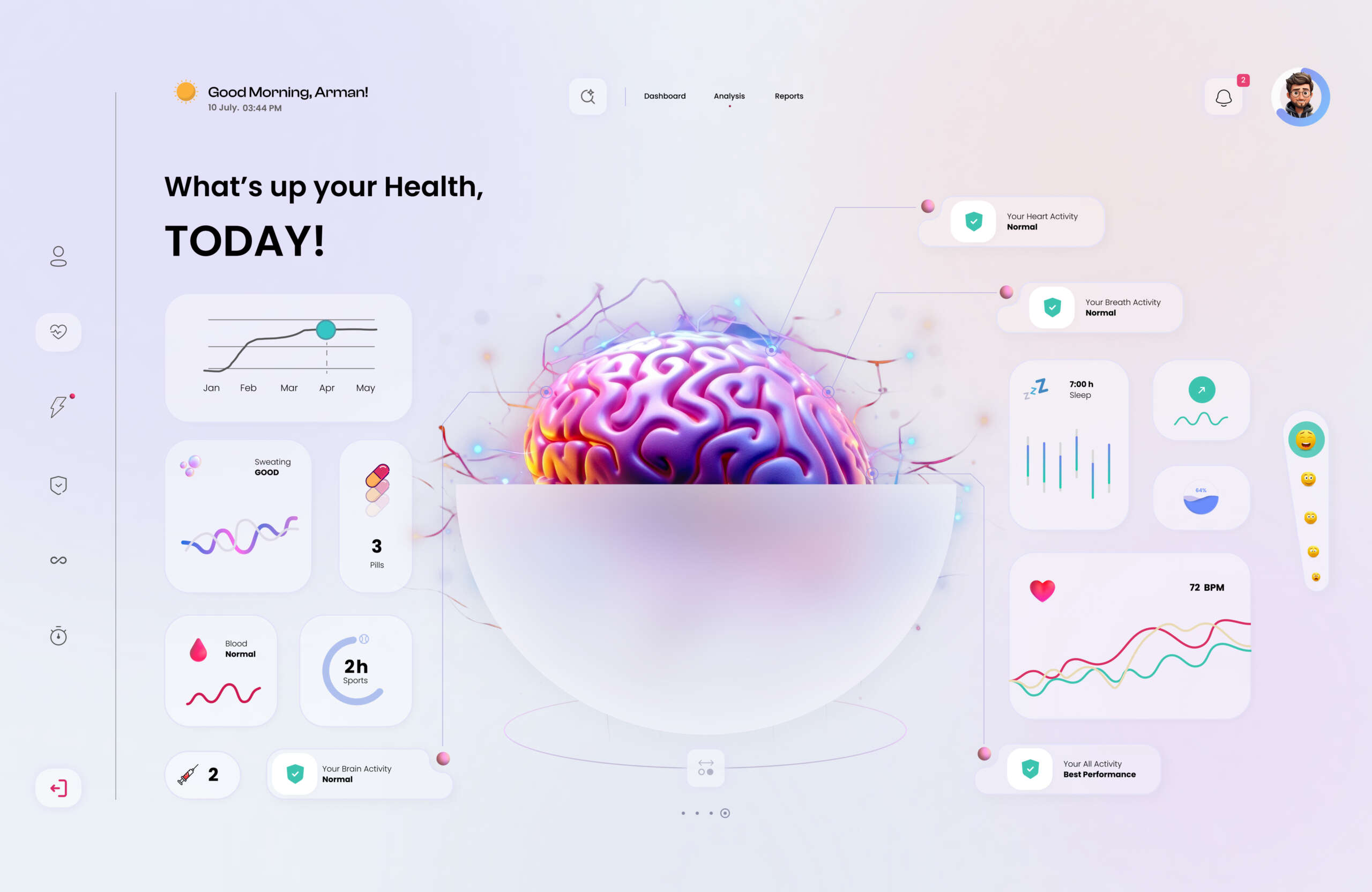
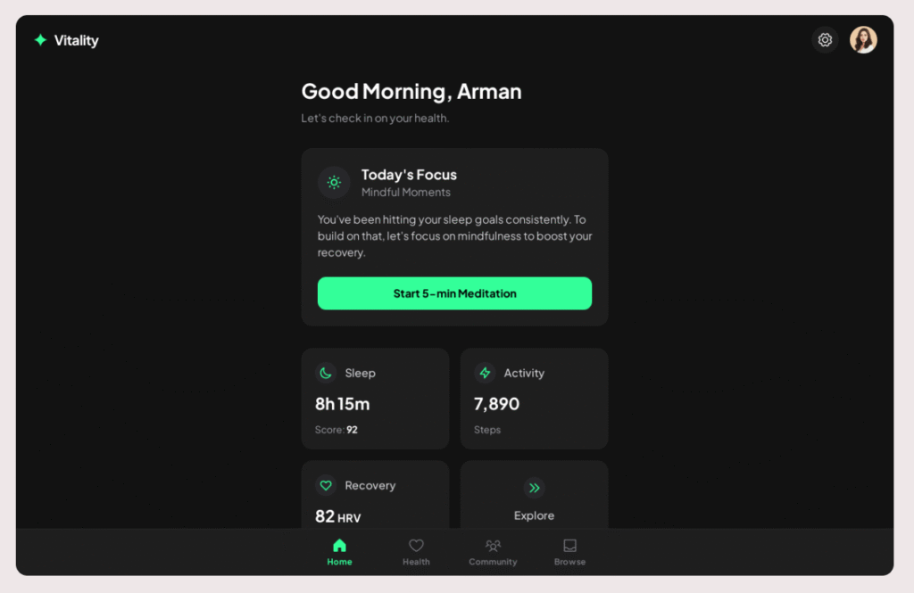
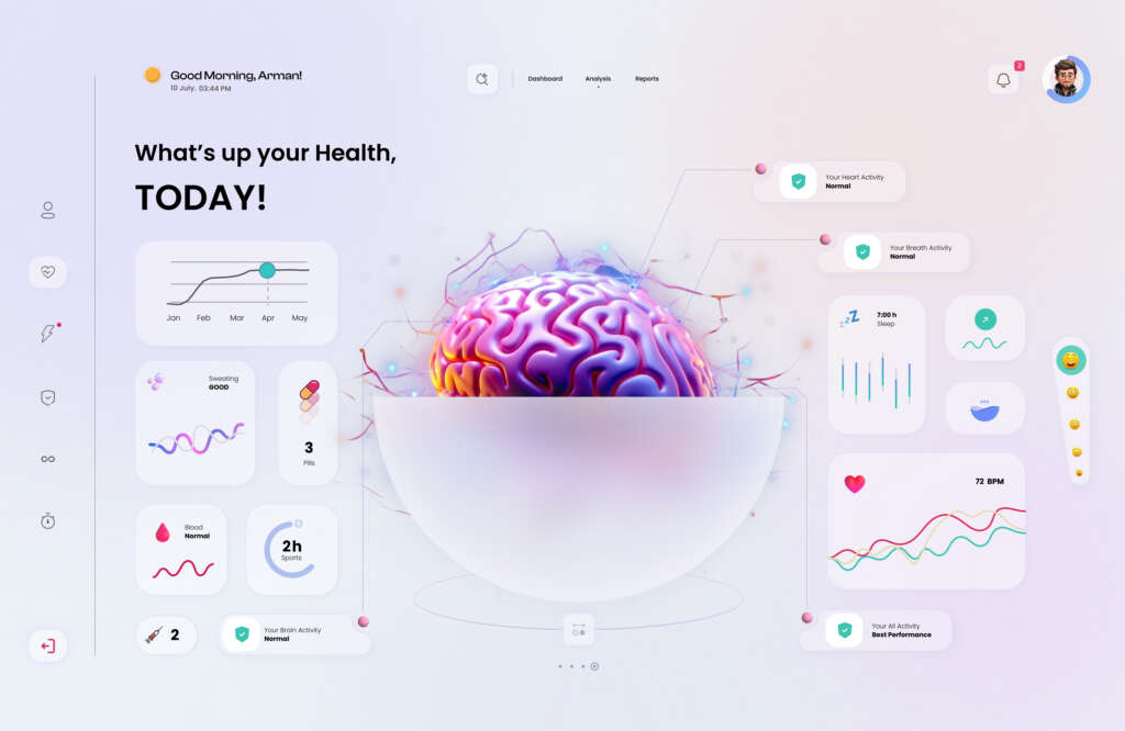
We focused on micro-interactions — subtle animations when data updated, hover effects on charts, and smooth transitions between views.
Typography was modern and legible, with bold headers for clarity and light body text for readability.
The result was a dashboard that felt alive, responsive, and trustworthy.
If applied to a real-world health platform, this dashboard design could:
A central visual anchor and intuitive widget grouping can encourage users to check their health stats more often.
Clear iconography, color-coded progress bars, and simplified charts can help users understand trends at a glance.
Personalized greetings, milestone highlights, and visual metaphors can inspire users to stay consistent with their wellness goals.
A well-structured layout with tiered navigation can reduce friction and make key insights accessible in seconds.
A futuristic yet human-centered aesthetic can position the platform as innovative, premium, and trustworthy.
By integrating these design principles, any health-focused product can transform raw data into a daily companion that informs, motivates, and delights its users.
Your brand deserves more than a functional interface — it deserves a human-centered, AI-ready design that inspires action.
Our UI UX Agency delivers scalable, future-proof solutions that merge beauty with performance
Please subscribe for the UI/UX Design related queries
© 2025 Graphymania. All rights reserved.