
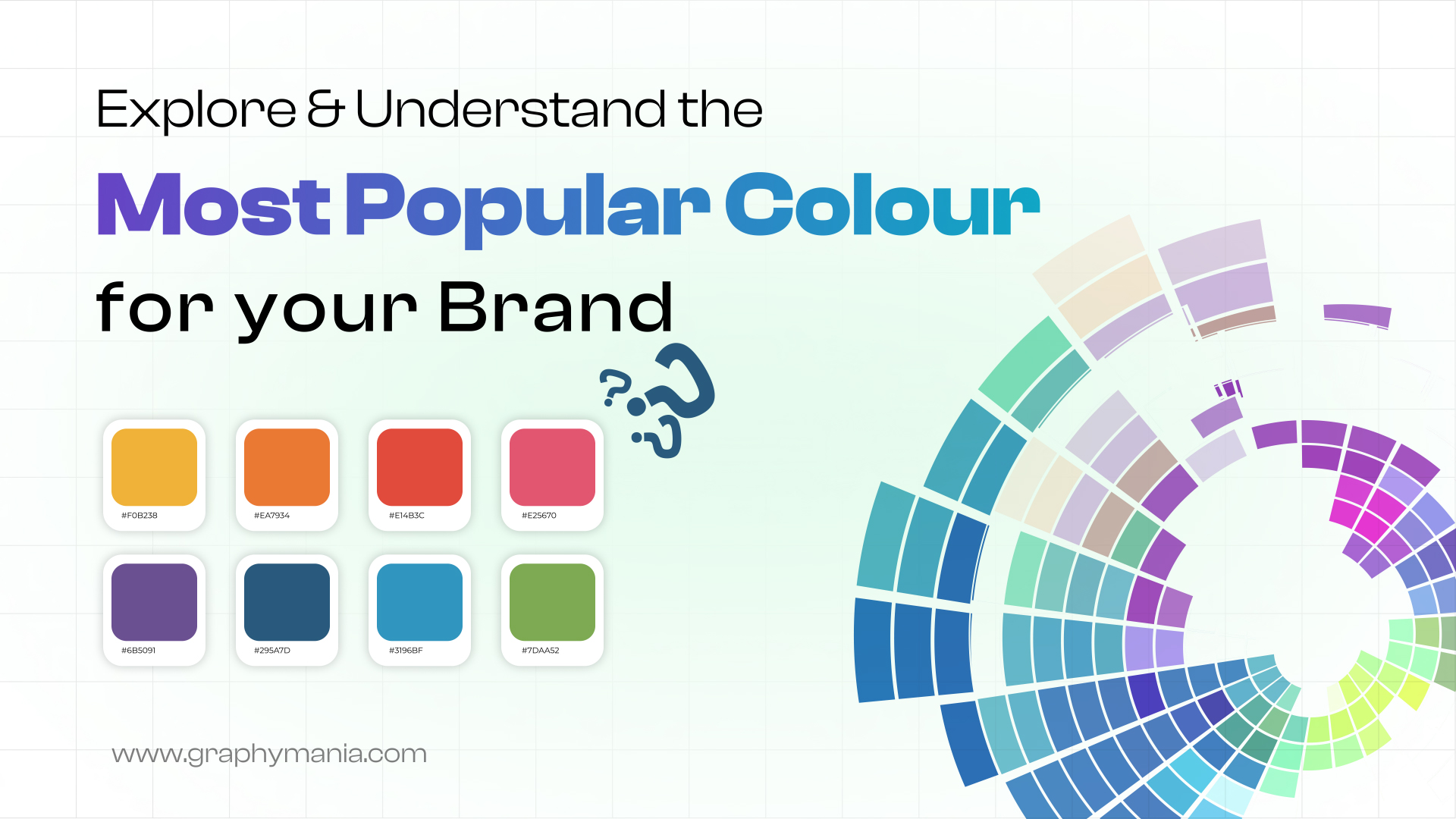
Colors are everywhere we look, from the branding of our favorite logos to the website designs we interact with daily. Did you know that color plays a significant role in shaping our decisions? According to research, 85% of consumer purchase decisions are influenced by color. The most popular colors in the world don’t just catch our attention – they evoke emotions, drive behavior, and leave lasting impressions. Whether you’re designing a website, creating a logo, or selecting packaging design, understanding how colors impact decision-making can give your brand a competitive edge. In this blog post, we’ll dive into the most popular colors, their meanings, and how they impact consumer behavior.
Top Colors That Have the Biggest Global Appeal
Colors hold significant power, and choosing the right color palette can set the tone for your brand identity. Let’s explore some of the most popular colors that have gained massive popularity worldwide, particularly in graphic design, logo design, and web design.
The Psychology Behind Popular Colors
Each color evokes unique emotions and meanings. Let’s break down the meanings of some of the most impactful colors:
- Blue Color: Blue is often associated with trust, calmness, and professionalism. It’s a popular choice in branding a logo for industries like healthcare and tech. Many web designers use blue to convey security and reliability.
- Green Color: Green symbolizes growth, harmony, and freshness. It’s a popular color in environmental branding and is often used in color palettes for brands related to sustainability. It also represents health and wellness, making it ideal for motion graphics related to health.
- Red Color: Red is an energetic, passionate color that grabs attention. It’s commonly used in logo design systems for companies aiming to evoke excitement and urgency, like in the food and retail industries.
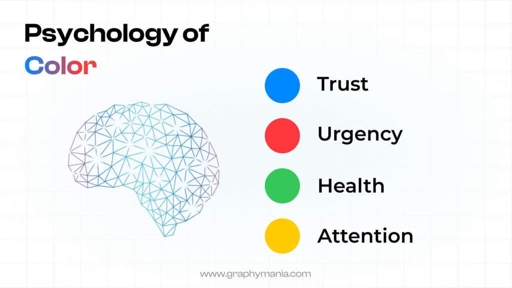
- Yellow Color: Yellow symbolizes positivity, warmth, and creativity. It’s a great color for branding a logo that seeks to communicate optimism and happiness. Used sparingly, yellow can draw attention in web design color palettes.
- Orange Color: Orange combines the energy of red and the cheerfulness of yellow, making it a color of enthusiasm and creativity. Color combinations involving orange are often seen in packaging design for products aimed at young audiences.
- Purple Color: Purple is often associated with luxury, creativity, and a sense of mystery. It’s a color used in premium brands and is often found in color palettes from color for high-end products or services.
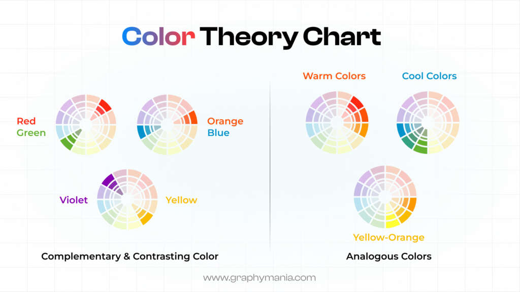
Why Color Theory Matters for Your Brand
Color theory is a crucial aspect of logo and branding design. It helps brands choose color combinations that resonate with their target audience and reflect their core values. By understanding color harmony, contrast, and psychology, brands can create an effective visual identity that speaks to consumers on a deeper level.
How Color Preferences Affect Consumer Behavior
Color preferences are deeply tied to psychological associations. Here are four examples of how colors influence consumers:
- Blue for Trust: Blue is universally linked with trust and reliability. Many companies in branding and logo design use blue to establish credibility with their audience. It’s particularly effective for UI designs where trust is essential.
- Red for Urgency: Red triggers urgency, making it a popular color in call-to-action buttons or sales promotions. It’s a go-to color in industries like retail, where branding a logo focuses on evoking immediate responses.
- Green for Wellness: Green is often used to convey a sense of health, peace, and sustainability. It’s perfect for health brands or products that focus on green energy, health, and environmental responsibility.
- Yellow for Optimism: Yellow is bright and cheery, often used to capture attention in web design color palettes or motion graphics. Brands like McDonald’s use yellow to invoke happiness and energy.
How Colors Influence Consumer Choices

The color choices in your color palette can significantly impact consumer behavior. Let’s take a look at five examples of how colors shape purchasing decisions:
– Blue for Calmness and Trust: When people see blue, they feel calm and reassured. Brands like Facebook and LinkedIn use blue to convey trust, helping consumers feel comfortable when interacting with their brand identity design services.
– Red for Excitement: Red grabs attention instantly. It’s often used in clearance sales or to highlight important information, triggering impulsive buying decisions.
– Green for Health and Nature: Many organic and eco-friendly brands use green to symbolize health and natural living. Think of how companies in wellness and food use green to emphasize their organic ingredients or sustainability practices.
– Yellow for Attention: Yellow is often used for promoting sales or limited-time offers. It’s a high-visibility color that captures attention and drives customers to act quickly.
– Purple for Luxury and Sophistication: Purple is often used by brands to communicate exclusivity and luxury. Many high-end packaging design products, like perfumes or jewelry, use purple to evoke a sense of premium quality.
Case Studies: How Successful Brands Use Color to Drive Success
Here are three case studies showcasing the power of color in branding:
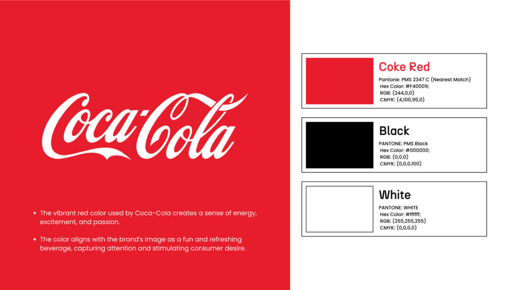
Coca-Cola’s use of red is legendary. The bright red color of their logo design evokes feelings of excitement, energy, and happiness, making it perfect for a beverage brand targeting a wide audience.
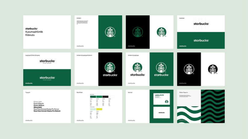
Starbucks uses green to convey sustainability, calmness, and eco-friendliness. The color connects with their mission to promote sustainable coffee practices and resonates with environmentally conscious consumers.
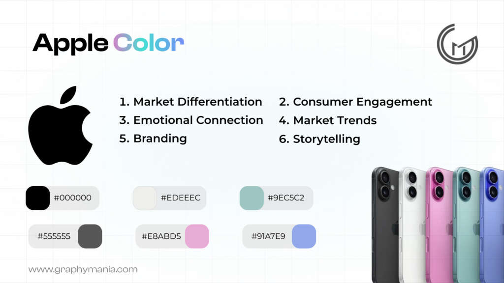
Apple’s minimalist use of neutral colors, like white, gray, and black, represents sophistication, simplicity, and elegance. This color palette complements their premium products and appeals to an audience seeking sleek, modern design.
Design Tips for Working with Colors
Understand the emotions each color evokes and match them with your brand values.
Use contrasting colors to make important elements stand out, like call-to-action buttons.
Experiment with complementary color combinations for a balanced and appealing design.
Use a simple color palette for a cohesive brand look across various platforms.
Test color combinations with different audiences to see which evokes the most positive reaction.
Conclusion
The most popular colors in the world are more than just aesthetic choices – they play a critical role in how consumers perceive your brand and influence their decision-making process. Whether you’re a web designer creating a UI design, a brand owner developing a color palette, or someone crafting a logo for branding, understanding the psychological impact of colors will help you make informed choices that align with your brand identity.
"A designer paints with pixels, but it’s color that breathes life—transforming interfaces into emotions."

MOHD ARMAN
FAQs
1. What are the most popular colors for branding?
- The most popular colors for branding include blue, red, green, yellow, and purple, each evoking different emotions like trust, excitement, and luxury.
2. How do colors impact decision-making?
Colors influence decision-making by triggering specific emotions. For example, red increases urgency, while blue promotes trust and calmness.
3. Why is color theory important for brands?
Color theory helps brands choose effective color combinations that align with their identity and evoke the right emotional response from their target audience.
Still here?
Great. Share your goals, and Graphymania will help you design, test, and ship elegant interfaces with the Glass Effect — fast and on brand.