Case Study – Global Analytics (CRM) Dashboard
How we enhanced a Global Analytics (CRM) Dashboard into a High-Impact Experience

Overview
As technology continues to evolve rapidly, data is only as powerful as the way it’s presented. Our UI UX Agency partnered with a global analytics platform to redesign their core dashboard — turning a cluttered, static interface into a visually dynamic, insight-driven experience. The result? A design that not only looks stunning but also empowers users to make faster, smarter decisions.
Let’s talk
We’re here to connect — just share your details and we’ll be in touch.
Who Should Focus – SaaS Industry
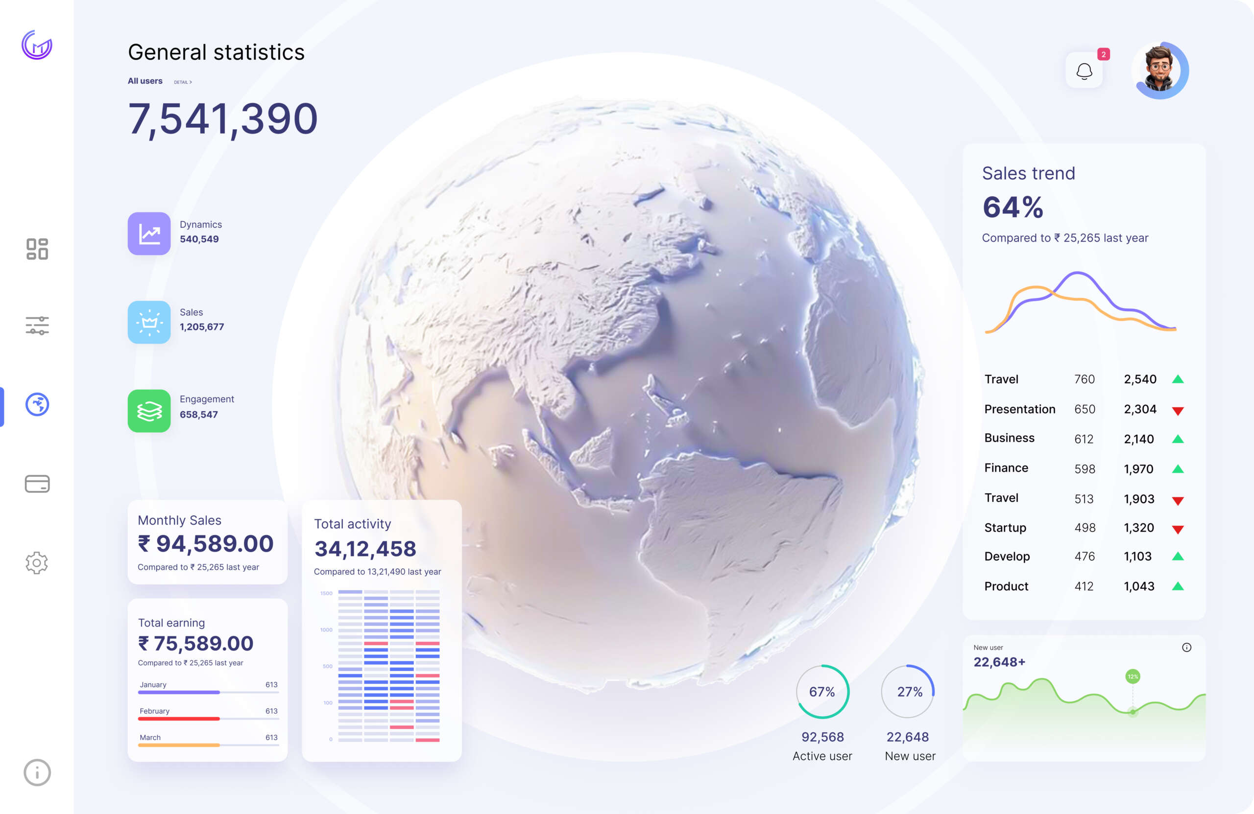
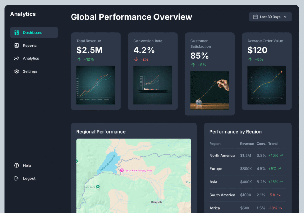
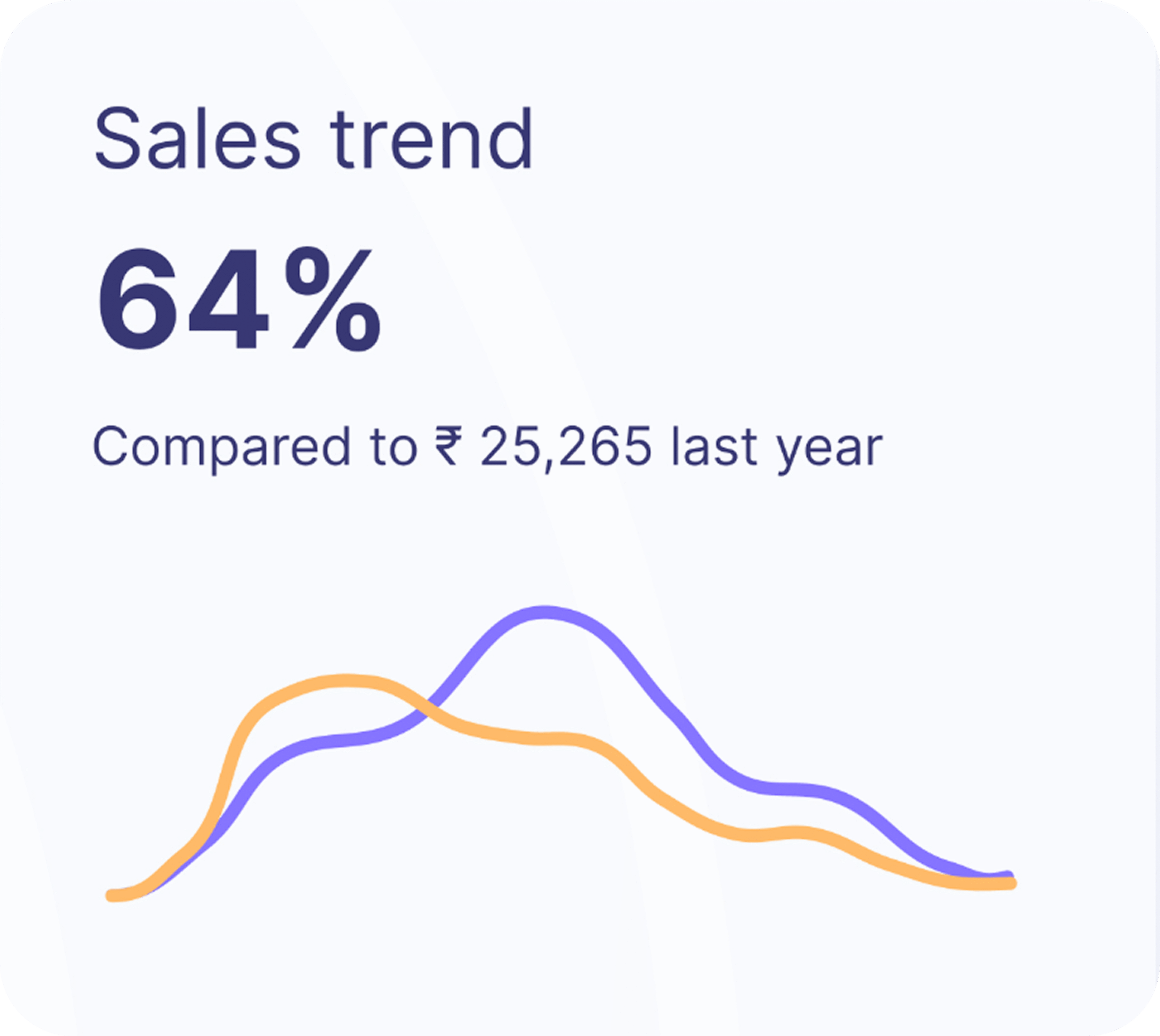
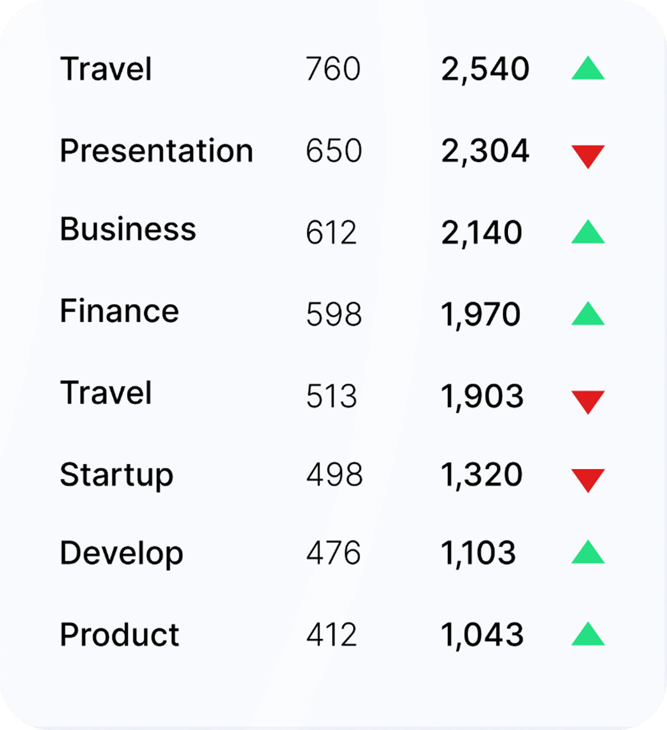
This is ideal for any SaaS provider specializing in real‑time business intelligence — whether serving travel, real estate, finance, e‑commerce, or other data‑driven sectors. Organizations with a broad platform ecosystem that reaches millions of users worldwide, and delivers critical metrics to guide strategic decisions, will find these goals especially relevant. Common goals for organizations with similar ambitions include:
- Improve data clarity for faster, more confident decision‑making
- Boost user engagement through intuitive, user‑friendly experiences
- Create a dashboard that feels as powerful as it is simple to navigate
- Offer an all‑in‑one platform that centralizes insights, tools, and workflows in one seamless environment
The Challenge oftenly faced by industry
Industry struggled to keep pace with user needs.
Overloaded visuals made it hard to focus on key metrics.
Inconsistent typography reduced readability.
Flat, uninspired visuals failed to convey the platform’s global reach.
Tools we use
We leverage industry-leading tools to design and prototype seamless digital experiences. These platforms help us collaborate, iterate, and deliver high-quality UI/UX solutions efficiently.

Figma

Adobe XD

Framer
Understanding the Core Problem
Through stakeholder interviews and user feedback, we uncovered three root issues:
- Navigation Overwhelm — Users had to scan multiple panels before finding relevant data.
- Lack of Visual Hierarchy — All metrics appeared equally important, diluting focus.
- Low Engagement — The static design didn’t encourage exploration or deeper analysis.
From Concept to Clickable Prototype
We approached the redesign with a clear vision: make data feel alive and actionable.
Key design decisions included:
- Introducing a 3D interactive globe to anchor the interface and highlight global reach.
- Grouping metrics into logical, color-coded panels for faster scanning.
- Using contrasting typography weights to guide the eye toward priority data.
- Integrating trend indicators (up/down arrows) for instant performance context.


Personalized Customer Insights
Our research revealed that users valued quick comparisons over deep dives.
- We added side-by-side performance metrics (e.g., current vs. last year’s sales trend).
- We simplified monthly sales visuals with clean bar charts and currency clarity.
- We highlighted active vs. new user counts with an easy-to-read line graph.


Designing for Trust and Delight
To build trust, we focused on consistency and clarity:
- Unified color palette with blue for stability, orange for growth, and red for alerts.
- Smooth micro-interactions that respond to hover and click, making the dashboard feel responsive.
- Balanced whitespace to reduce visual fatigue and improve scanability.
Beyond Expectations: The Impact
If applied to a live SaaS platform, this dashboard design has the potential to:
- Accelerate decision-making by presenting key metrics in a clear, prioritized layout
- Increase user engagement through interactive visuals like the 3D globe and trend indicators
- Reduce cognitive load with a clean, color-coded hierarchy that guides the eye naturally
- Enable cross‑team collaboration by centralizing insights in one intuitive interface
- Serve as an all‑in‑one platform, integrating analytics, performance tracking, and category‑specific insights in a single, seamless environment
By combining visual clarity with functional depth, this concept is designed to help organizations not just view their data, but act on it with confidence and speed
Let’s create your next success story.

Our UI UX Agency delivers scalable, human-centered, and AI-ready designs that bring your vision to life — and your data to action.


