
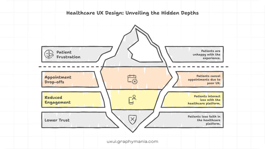
In healthcare, bad user experience does not just frustrate users. It can delay care, reduce patient trust, and even discourage people from seeking treatment.
A patient trying to book an appointment should not feel like they are solving a puzzle. Yet many healthcare platforms still struggle with confusing navigation, poor accessibility, and complex workflows.
For startups, product managers, and UX designers building digital health products, Healthcare UX Design is not just about aesthetics. It directly influences patient engagement, retention, and clinical outcomes.
Despite the rapid growth of digital health platforms, many systems still repeat the same design mistakes. These issues quietly erode patient trust and damage the overall patient experience.
This article explores the most common healthcare user experience mistakes and how teams can avoid them while designing better digital health platforms.
Why Healthcare UX Design Matters More Than Most Industries
Unlike e-commerce or social media platforms, healthcare platforms operate in high-stress environments.
Patients often interact with apps or portals when they are:
- Sick
- Anxious
- Searching for urgent information
- Managing chronic conditions
- Supporting family members
If the experience is confusing, patients quickly lose confidence.
Strong digital health UX design focuses on reducing cognitive load, simplifying actions, and guiding users clearly through important healthcare journeys. Investing in healthcare UI UX design services ensures that platforms are built around patient needs, not system complexity.
When done well, UX can:
- Increase appointment bookings
- Improve medication adherence
- Reduce support calls
- Strengthen patient trust
When done poorly, it creates friction at every step.
Let’s explore the most common mistakes that undermine patient experience.
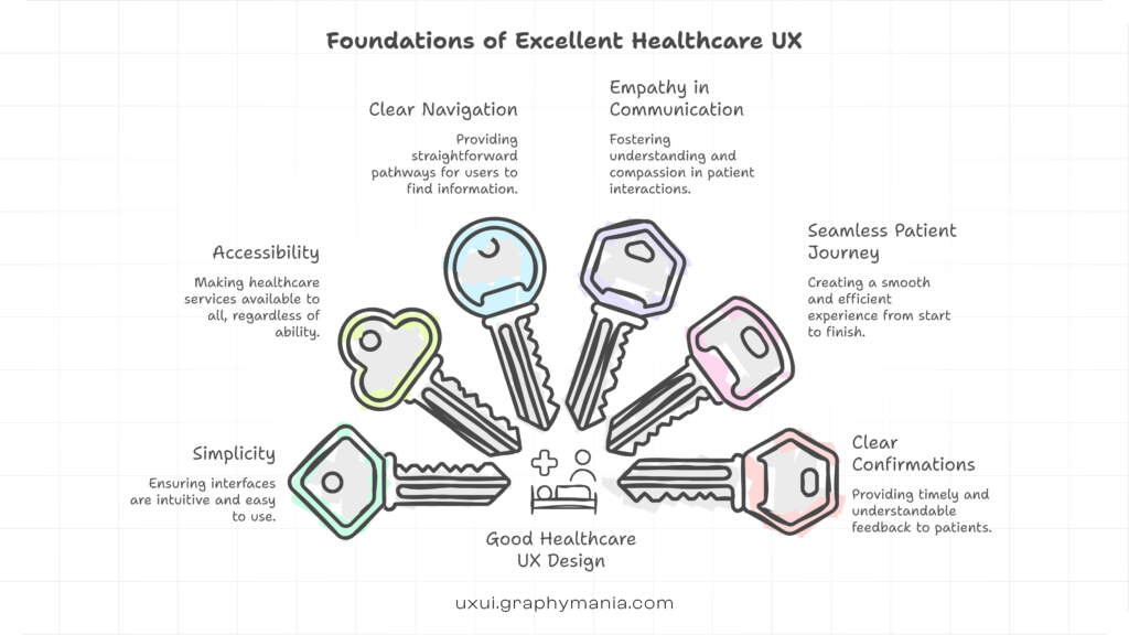
A Practical Framework: 7 Healthcare UX Design Mistakes That Hurt Patient Experience
Instead of random design flaws, most UX failures in healthcare fall into clear patterns. Understanding these patterns helps teams avoid repeating them.
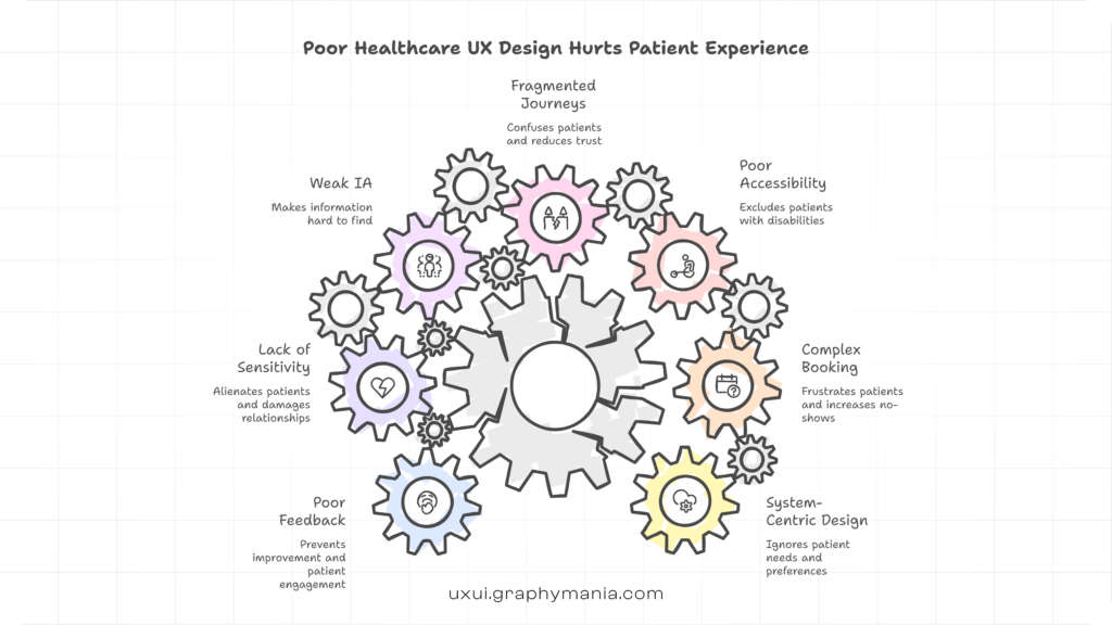
1. Designing for Systems Instead of Patients
Many healthcare platforms are designed around internal systems rather than patient needs.
Electronic health records, insurance structures, and hospital workflows often dictate the interface. As a result, patients see terminology and steps that make sense only to medical professionals.
Example:
A patient portal may display options such as:
- Encounter summaries
- CPT billing codes
Clinical documentation
For patients, these labels are confusing.
A strong Healthcare UX Design approach translates medical complexity into clear language.
A better design would use:
- Visit summary
- Upcoming appointment
Medical test results
UX should act as a bridge between medical systems and human understanding.
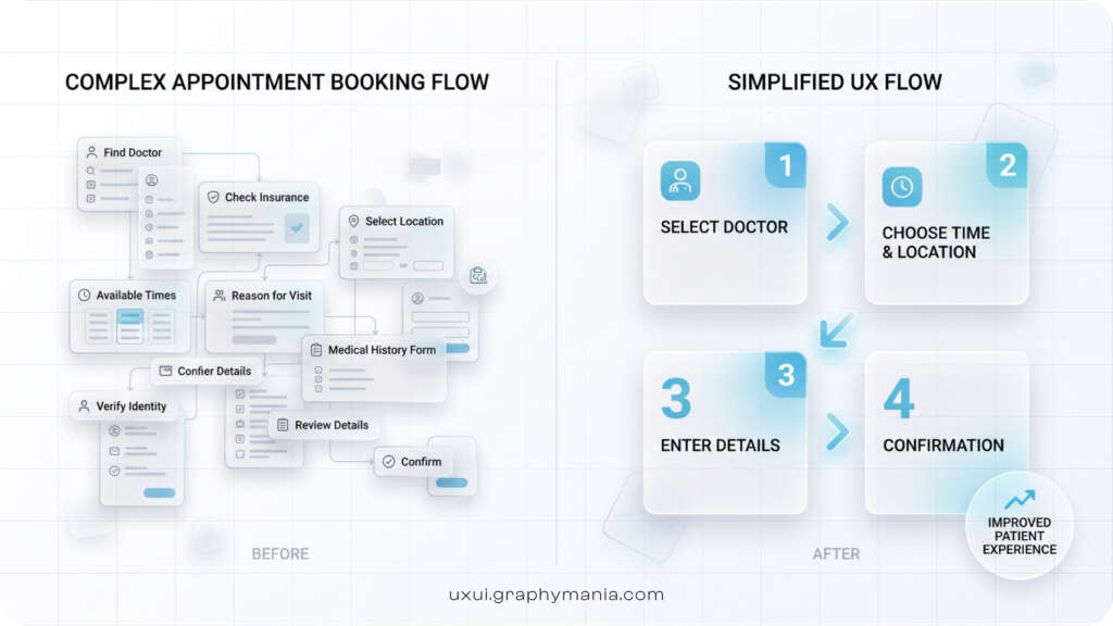
2. Overcomplicated Appointment Booking
Booking a medical appointment should be simple. Unfortunately, many healthcare websites make this process unnecessarily complex.
Common issues include:
- Too many steps
- Unclear doctor selection
- Confusing time slot interfaces
Hidden availability
Patients often abandon the process before completing it.
Example scenario:
A patient with a fever tries to book a consultation. They are asked to select:
- Department
- Specialty
- Sub-specialty
- Service type
- Doctor
Clinic location
This friction drives drop-offs.
Good patient experience design in healthcare simplifies decisions and guides users toward the right option.
A well-designed flow might ask:
“What do you need help with today?”
Then guide users step by step.
3. Ignoring Accessibility and Inclusive Design
Healthcare platforms serve people of all ages, abilities, and digital literacy levels.
Yet accessibility is frequently overlooked.
Common accessibility issues include:
- Small font sizes
- Poor color contrast
- Complex navigation
- Difficult form inputs
Lack of screen reader support
For elderly users or visually impaired patients, these barriers can make platforms unusable.
Strong healthcare user experience design prioritizes inclusive design by ensuring:
- Clear typography
- Simple layout
- Voice compatibility
- Accessible forms
Easy readability
Accessibility is not just compliance. It is essential to patient care.
4. Fragmented Patient Journeys
Many healthcare platforms treat each feature as a standalone tool rather than as part of a connected journey.
Patients often experience broken workflows, such as:
- Booking appointments on one platform
- Viewing reports on another
- Messaging doctors on a third system
This fragmentation creates confusion and forces patients to remember multiple logins.
Example:
A patient receives a lab test reminder in an app. After the test, results are delivered through a different portal.
This disconnect increases frustration.
Effective digital health UX design focuses on seamless patient journeys.
A unified platform should allow patients to:
- Book visits
- Access records
- Receive prescriptions
Communicate with doctors
All within a single ecosystem.
5. Poor Information Architecture
Healthcare platforms contain complex information. Without proper structure, users struggle to find what they need.
Common IA problems include:
- Overloaded dashboards
- Unclear menu labels
- Too many navigation levels
Hidden critical information
Example:
A patient searching for vaccination records may have to navigate through multiple unrelated sections.
Good Healthcare UX Design organizes information based on patient priorities rather than system categories.
Key sections often include:
- Appointments
- Medical records
- Prescriptions
- Test results
Messages
Clear structure helps patients act faster and with confidence.
6. Lack of Emotional Sensitivity in Design
Healthcare interactions often happen during stressful moments.
Yet many interfaces treat patients like generic users rather than individuals facing medical concerns.
Cold system messages such as:
“Request failed. Try again later.”
can increase anxiety.
More empathetic UX writing could say:
“We couldn’t process your request right now. Please try again or contact support if the issue continues.”
Empathy in UX includes:
- Reassuring language
- Clear instructions
- Helpful error messages
Progress indicators
In healthcare, tone matters just as much as usability.
7. Weak Feedback and Confirmation Systems
Patients need reassurance that their actions were successful.
Many healthcare platforms fail to provide clear confirmations.
Examples include:
- No appointment confirmation
- Missing prescription notifications
Unclear payment success messages
Patients are left wondering:
Did my appointment go through?
Was the prescription sent to the pharmacy?
Strong patient experience design in healthcare uses clear feedback loops.
Effective systems provide:
- Instant confirmations
- Email or SMS notifications
Clear status tracking
These small UX details significantly improve trust.
How Better Healthcare UX Design Improves Patient Experience
Fixing these mistakes does more than improve interface quality. It transforms how patients interact with healthcare systems.
Well-designed healthcare platforms can:
- Increase appointment completion rates
- Improve treatment adherence
- Reduce operational burden on hospitals
Enhance patient satisfaction
For startups and product teams building digital health solutions, UX should be treated as a strategic healthcare infrastructure layer.
Design decisions directly influence patient outcomes.
The most successful healthcare products today focus on simplicity, empathy, and clarity.
Conclusion: Healthcare UX Design Is Patient Care
Every digital interaction in healthcare is part of the patient journey.
If the experience is confusing, patients disengage. If the experience is intuitive and supportive, patients feel confident and cared for.
Great Healthcare UX Design reduces complexity, improves accessibility, and creates seamless patient journeys.
For product managers, startup founders, and UX designers, the goal is not just to build functional systems. The goal is to design experiences that support people during some of the most important moments of their lives.
When healthcare UX is done right, technology disappears, and patient care becomes the focus.
"In healthcare, every interface decision affects human trust. Good UX does not just make systems usable, it makes care accessible."

MOHD ARMAN
FAQs
1. What is Healthcare UX Design?
User experience (UX) refers to how a person feels when interacting with a digital product or service. It includes usability, design, navigation, and overall satisfaction.
2. Why is UX important in healthcare platforms?
UX improves patient engagement, simplifies medical processes, and helps users access healthcare services without confusion or frustration.
3. What are common healthcare user experience mistakes?
Common mistakes include complex appointment booking, poor accessibility, fragmented systems, confusing navigation, and lack of empathetic design.
4. How does UX affect patient trust?
Clear navigation, reliable systems, and transparent communication help patients feel confident when using healthcare platforms.
5. How can healthcare startups improve patient experience through UX?
Startups can focus on simplifying workflows, designing for accessibility, unifying patient journeys, and prioritizing user-centered design principles.